Chi-Square Goodness of fit (R)
इस पोस्ट में, मैं Chi-square goodness of fit test पर चर्चा करना चाहता हूँ।
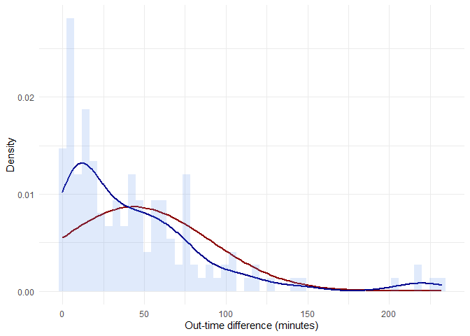
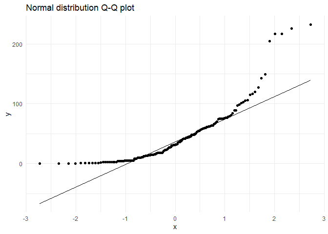
Uni-variate analysis के दौरान EDA में attendance data set का उपयोग करते हुए, मैंने q-q plot का उपयोग करके समझाने की कोशिश की कि 'out-time-diff' feature सामान्य रूप से वितरित नहीं है। इसे सांख्यिकीय रूप से साबित करने के लिए, हमें chi square tests का उपयोग करना होगा।
ggplot(data,aes(x = alt.distr)) +
  stat_function(fun = dnorm, color="darkred",  size = 1,
                args = list(mean = mean(data$alt.distr),
                                         sd = sd(data$alt.distr) )) +
  geom_density(aes(y=..density..), color="darkblue",  size = 1)+
  geom_histogram(aes(y=..density..), bins = 50, fill = "cornflowerblue", alpha = 0.2) +
  labs(x = 'Out-time difference (minutes)', y='Density') +
  theme_minimal()
संदर्भ के लिए q-q plot:
ggplot(data,aes(sample = alt.distr)) +
  stat_qq() + stat_qq_line() +
  ggtitle("Normal distribution Q-Q plot") +
  theme_minimal()
हर समूह के लिए chi-square goodness of fit test के लिए निम्नलिखित परिकल्पना होगी:
\(H_0\): 'diff-in-time' के अवलोकित आवृत्तियों और सामान्य वितरण से अपेक्षित आवृत्तियों के बीच कोई सांख्यिकीय रूप से महत्वपूर्ण अंतर नहीं है
\(H_1\): एक सांख्यिकीय रूप से महत्वपूर्ण अंतर है
अवधियों की संख्या निम्नलिखित सूत्र द्वारा दी गई है,
N <- floor(1+3.3*log10(length(data$alt.distr)))
सामान्य वितरण को ध्यान में रखते हुए अवलोकित और अपेक्षित आवृत्तियाँ इस प्रकार हैं:
minimum.dist <- min(data$alt.distr)
maximum.dist <- max(data$alt.distr)
n <- length(data$alt.distr)
dist.mean <- mean(data$alt.distr)
dist.sd <- sd(data$alt.distr)
range.group <- (maximum.dist - minimum.dist)/N
data <- data %>% mutate(class = floor(alt.distr/range.group),
                        class_name_min =  minimum.dist + class*range.group,
                        class_name_max = minimum.dist + (class+ 1)*range.group,
                        class_name = paste0(class_name_min, '-', class_name_max))
chi.sq.table <- data %>% group_by(class, class_name) %>% summarise(obs_freq = n(),
                                                                   class_name_min = mean(class_name_min),
                                                                   class_name_max = mean(class_name_max)) %>%
  mutate(exp_freq = pnorm(class_name_max, dist.mean, dist.sd)*n - pnorm(class_name_min, dist.mean, dist.sd)*n,
         chi.sq = ((obs_freq - exp_freq)^2)/exp_freq)
library(kableExtra)
kable(chi.sq.table %>% dplyr::select(class_name, obs_freq, exp_freq, chi.sq),
      caption = 'Cross Tabulation') %>%
  kable_styling(full_width = F) %>%
  column_spec(1, bold = T) %>%
  collapse_rows(columns = 1:2, valign = "middle") %>%
  scroll_box()
| class | class_name | obs_freq | exp_freq | chi.sq |
|---|---|---|---|---|
| 0 | 0-29 | 74 | 32.0974138 | 54.7030591 |
| 1 | 29-58 | 37 | 39.1354970 | 0.1165271 |
| 2 | 58-87 | 28 | 32.4557899 | 0.6117264 |
| 3 | 87-116 | 9 | 18.3059346 | 4.7307292 |
| 4 | 116-145 | 4 | 7.0201144 | 1.2992795 |
| 5 | 145-174 | 1 | 1.8295669 | 0.3761443 |
| 7 | 203-232 | 4 | 0.0389060 | 403.2865367 |
| 8 | 232-261 | 1 | 0.0031698 | 313.4780888 |
Chi-square independence test करना:
# Functions used in chi-sq-test

chi.sq.plot <- function(pop.mean=0, alpha = 0.05, chi.sq, df,
                              label = 'Chi Square distribution',title = 'Chi Square goodness of fit test'){
  # Creating a sample chi-sq distribution
  range <- seq(qchisq(0.0001, df), qchisq(0.9999, df), by = (qchisq(0.9999, df)-qchisq(0.0001, df))*0.001)
  chi.sq.dist <- data.frame(range = range, dist = dchisq(x = range, ncp = pop.mean, df = df)) %>%
    dplyr::mutate(H0 = if_else(range <= qchisq(p = 1-alpha, ncp = pop.mean, df = df,lower.tail = TRUE),'Retain', 'Reject'))
  # Plotting sampling distribution and x_bar value with cutoff
  plot.test <- ggplot(data = chi.sq.dist, aes(x = range,y = dist)) +
    geom_area(aes(fill = H0)) +
    scale_color_manual(drop = TRUE, values = c('Retain' = "#00BFC4", 'Reject' = "#F8766D"), aesthetics = 'fill') +
    geom_vline(xintercept = chi.sq, size = 2) +
    geom_text(aes(x = chi.sq, label = paste0('Chi Sq = ', round(chi.sq,3)), y = mean(dist)), colour="blue", vjust = 1.2) +
    labs(x = label, y='Density',  title = title) +
    theme_minimal()+theme(legend.position="bottom")
  plot(plot.test)
}
chi.test <- chisq.test(chi.sq.table$obs_freq, p = chi.sq.table$exp_freq, rescale.p = TRUE)
print(chi.test)
##
##  Chi-squared test for given probabilities
##
## data:  chi.sq.table$obs_freq
## X-squared = 640.34, df = 7, p-value < 2.2e-16
chi.sq.plot(chi.sq = chi.test$statistic, df = chi.test$parameter, title = 'Null hypothesis to test normality')
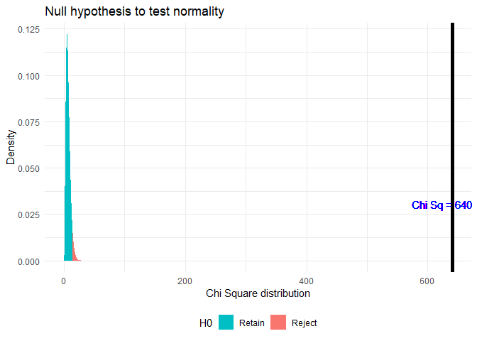
चूंकि p < α है, जहाँ α = 0.05, Null hypothesis को अस्वीकार कर दिया गया है।
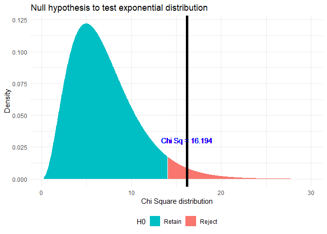
इसी पोस्ट में, मैंने Q-Q plot का उपयोग करके दिखाया कि वितरण एक exponential distribution की तरह दिखता है। यह परीक्षण करने के लिए कि क्या यह सांख्यिकीय रूप से महत्वपूर्ण है, मैं Chi-Square test का उपयोग करूंगा।
हर समूह के लिए chi-square goodness of fit test के लिए निम्नलिखित परिकल्पना होगी:
\(H_0\): 'diff-in-time' के अवलोकित आवृत्तियों और exponential distribution से अपेक्षित आवृत्तियों के बीच कोई सांख्यिकीय रूप से महत्वपूर्ण अंतर नहीं है
\(H_1\): एक सांख्यिकीय रूप से महत्वपूर्ण अंतर है
minimum.dist <- min(data$alt.distr)
maximum.dist <- max(data$alt.distr)
n <- length(data$alt.distr)
lamda <- 1/mean(sd(data$alt.distr),mean(data$alt.distr))
range.group <- (maximum.dist - minimum.dist)/N
data <- data %>% mutate(class = floor(alt.distr/range.group),
                        class_name_min =  minimum.dist + class*range.group,
                        class_name_max = minimum.dist + (class+ 1)*range.group,
                        class_name = paste0(class_name_min, '-', class_name_max))
chi.sq.table <- data %>% group_by(class, class_name) %>% summarise(obs_freq = n(),
                                                                   class_name_min = mean(class_name_min),
                                                                   class_name_max = mean(class_name_max)) %>%
  mutate(exp_freq = pexp(class_name_max, lamda)*n - pexp(class_name_min, lamda)*n,
         chi.sq = ((obs_freq - exp_freq)^2)/exp_freq)
| class | class_name | obs_freq | exp_freq | chi.sq |
|---|---|---|---|---|
| 0 | 0-29 | 74 | 73.9534204 | 0.0000293 |
| 1 | 29-58 | 37 | 39.3388103 | 0.1390493 |
| 2 | 58-87 | 28 | 20.9259016 | 2.3914319 |
| 3 | 87-116 | 9 | 11.1313320 | 0.4080892 |
| 4 | 116-145 | 4 | 5.9212050 | 0.6233577 |
| 5 | 145-174 | 1 | 3.1497280 | 1.4672157 |
| 7 | 203-232 | 4 | 0.8912488 | 10.8435869 |
| 8 | 232-261 | 1 | 0.4740912 | 0.5833899 |
मैं देखता हूँ कि अपेक्षित आवृत्ति का मान अधिकांश मामलों में अवलोकित आवृत्ति के मान के करीब है।
##
##  Chi-squared test for given probabilities
##
## data:  chi.sq.table$obs_freq
## X-squared = 16.194, df = 7, p-value = 0.0234
उपरोक्त तालिका से, मैं देख सकता हूँ कि अधिकांश उच्च chi-sq मान वर्ग 7 और 8 के कारण हैं जहाँ अवलोकित आवृत्ति 10 से कम है। उन मामलों को नजरअंदाज करते हुए, मुझे मिलता है:
##
##  Chi-squared test for given probabilities
##
## data:  chi.sq.table$obs_freq
## X-squared = 2.8385, df = 3, p-value = 0.4172
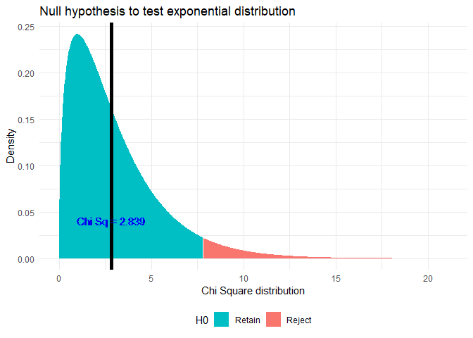
चूंकि p > α है, जहाँ α = 0.05, Null hypothesis को बनाए रखा गया है।
मैं इन चर के बीच संबंध की प्रभाव आकार या ताकत जानना चाहता हूँ। इसे Cramers-V द्वारा समझाया गया है:
library(lsr)
cramersV(chi.sq.table$obs_freq, p = chi.sq.table$exp_freq, rescale.p = TRUE)
## [1] 0.03988245