Visualizalising tabular data (Airbnb)
लेखक: अच्युतुनी श्री हर्ष
इस विज़ुअलाइजेशन में, हम डेटा टाइप टेबल पर विभिन्न विज़ुअलाइजेशन प्रकारों को देखेंगे।
Matplotlib Python में विज़ुअलाइजेशन के लिए सबसे लोकप्रिय लाइब्रेरी है। Seaborn इसके ऊपर बनी है जिसमें एकीकृत विश्लेषण, विशेष प्लॉट और Pandas के साथ अच्छी इंटीग्रेशन है। Plotly express भी एक और विज़ुअलाइजेशन लाइब्रेरी है।
इसके अलावा Seaborn का पूरा गैलरी या Matplotlib देखें।
#disable some annoying warnings
import warnings
warnings.filterwarnings('ignore', category=FutureWarning)

#plots the figures in place instead of a new window
%matplotlib inline

import matplotlib.pyplot as plt
import seaborn as sns
import plotly.express as px

import pandas as pd
import numpy as np
इस ब्लॉग में, हम लंदन के Airbnb डेटा पर नज़र डालेंगे। हम कुछ ट्रेंड, पैटर्न और डेटा पर मौसमी प्रभाव देखेंगे।
पहले, चलिए Airbnb की लोकप्रियता पर समय के साथ विचार करते हैं। लोकप्रियता समीक्षाओं की संख्या के समानुपाती है। reviews डेटा सेट को इंपोर्ट करते हैं:
reviews = pd.read_csv('reviews.csv.gz', parse_dates=['date'])
reviews.head()
| listing_id | id | date | reviewer_id | reviewer_name | comments | |
|---|---|---|---|---|---|---|
| 0 | 11551 | 30672 | 2010-03-21 | 93896 | Shar-Lyn | The flat was bright, comfortable and clean and... |
| 1 | 11551 | 32236 | 2010-03-29 | 97890 | Zane | We stayed with Adriano and Valerio for a week ... |
| 2 | 11551 | 41044 | 2010-05-09 | 104133 | Chase | Adriano was a fantastic host. We felt very at ... |
| 3 | 11551 | 48926 | 2010-06-01 | 122714 | John & Sylvia | We had a most wonderful stay with Adriano and ... |
| 4 | 11551 | 58352 | 2010-06-28 | 111543 | Monique | I'm not sure which of us misunderstood the s... |
Scatter plot
समीक्षाओं की संख्या जानने के लिए, हम हर दिन कुल समीक्षाओं को जोड़ते हैं, और फिर इसे समय के साथ एक स्कैटर प्लॉट के रूप में प्लॉट करते हैं।
fs, axs = plt.subplots(1, figsize=(15,10))
plt.title("Airbnb London: Number of reviews across time", fontsize=30)

reviews.groupby('date').aggregate({'listing_id':'count'}).reset_index().plot.scatter(x = 'date', y = 'listing_id', alpha = 0.25, ax = axs)
axs.set_ylabel('Number of reviews', fontsize=20)
axs.set_xlabel('Time', fontsize=20)
plt.show()
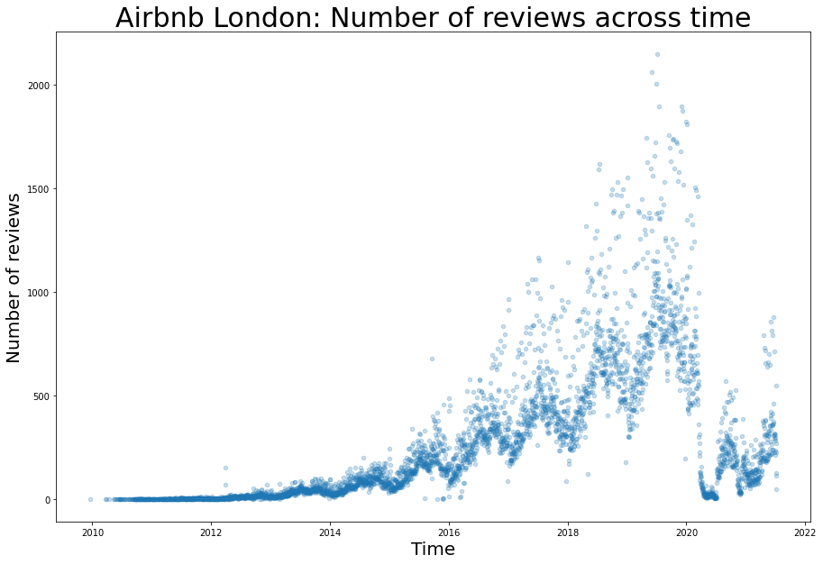
इस प्लॉट से, हम निम्नलिखित देख सकते हैं:
1. महामारी से पहले व्यापार में एक गुणात्मक वृद्धि है और कोविड से संबंधित प्रतिबंधों के शुरू होने के बाद इसमें अचानक गिरावट आई है।
2. हर साल के भीतर मौसमी प्रभाव स्पष्ट है।
इन ट्रेंड्स को विस्तार से समझने के लिए, हमें प्लॉट के दो भागों पर ज़ूम करना चाहिए। पहले हमें डेटा के मौसमी प्रभाव और ट्रेंड को खोजना चाहिए, और फिर महामारी से पहले के एक वर्ष पर ज़ूम करना चाहिए। दूसरे, हम 2020-21 में ज़ूम कर सकते हैं ताकि कोविड से संबंधित लॉकडाउन के पैटर्न की पहचान कर सकें।
# getting the total number of reviews per day
reviews_time = reviews.groupby('date').aggregate({'listing_id':'count'}).reset_index()
reviews_time['year'] = reviews_time.date.dt.year

# Pre covid data
reviews_time_proper = reviews_time[(reviews_time.year < 2020)]
हम पूर्व-महामारी डेटा में मौसमी प्रभाव और ट्रेंड को पहचान सकते हैं (इस ब्लॉग में समझाया नहीं गया)। डेटा को ट्रेंड, मौसमी और यादृच्छिक घटक में विभाजित करने पर हमें निम्नलिखित मिलता है:
from statsmodels.tsa.seasonal import seasonal_decompose
result = seasonal_decompose(reviews_time_proper.listing_id, model='additive', period = 365)
print(result.plot())
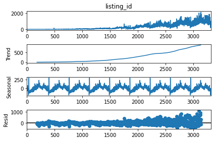
हम डेटा में एक गुणात्मक ट्रेंड और एक दोहराने वाली स्थिर मौसमीता देख सकते हैं। पूर्व-महामारी ट्रेंड की पहचान और भविष्यवाणी करना और 2020-21 के लिए भविष्यवाणी करना।
y_values = result.trend[182:3136]
x_values = range(182, 3136)
coeffs = np.polyfit(x_values, y_values, 2)
poly_eqn = np.poly1d(coeffs)
y_hat = poly_eqn(range(365, len(reviews_time[reviews_time.year < 2020])))
y_hat1 = poly_eqn(range(len(reviews_time[reviews_time.year < 2020]), len(reviews_time)))
मौसमीता का अनुमान लगाने के लिए एक बहुपद समीकरण का उपयोग करना।
y_values = reviews_time[reviews_time.year == 2019].listing_id
x_values = range(365)
coeffs = np.polyfit(x_values, y_values, 15)
poly_eqn = np.poly1d(coeffs)
y_hat_seasonal = poly_eqn(range(365))
2020-21 में पैटर्न का अनुमान लगाने के लिए एक बहुपद समीकरण का उपयोग करना।
reviews_covid = reviews_time[reviews_time.year >= 2020]
y_values = reviews_covid.listing_id
x_values = range(len(reviews_covid.listing_id))
coeffs = np.polyfit(x_values, y_values, 17)
poly_eqn = np.poly1d(coeffs)
y_hat_covid = poly_eqn(range(25, len(reviews_covid.listing_id)-15))
from mpl_toolkits.axes_grid1.inset_locator import mark_inset, inset_axes
from matplotlib.patches import ConnectionPatch # making lines from top lot to below plot

# Two plots, the main on the top with height 20 inches and the bottom one is 10 inches.
fs, axs = plt.subplots(2, figsize=(20,30), gridspec_kw={'height_ratios': [2, 1]}, constrained_layout=True)

# Title
plt.suptitle("Airbnb London: Number of reviews across time", fontsize=30)

# First plot, main scatterplot
reviews.groupby('date').aggregate({'listing_id':'count'}).\
    reset_index().plot.scatter(x = 'date', y = 'listing_id', alpha = 0.25, ax = axs[0])

# adding the trend lines
axs[0].plot(reviews_time[365:len(reviews_time[reviews_time.year < 2020])].date,y_hat, color='red')
axs[0].plot(reviews_time[len(reviews_time[reviews_time.year < 2020]):].date,y_hat1, color='red', linestyle='dashed')

# Modifying the labels and title
axs[0].set_ylabel('Number of reviews', fontsize=15)
axs[0].set_xlabel('Time', fontsize=15)
axs[0].set_title('Total reviews of all types of rooms across London. A trend line is plotted taking the exponential growth of the business before Covid 19 and projecting the same trend during Covid. \n'+
'Seasonality before Covid is shown by zooming for 2019 (sample year). The affect of covid related lockdowns is also shown by zooming from 2020 onwards.',
                      fontsize=15, loc='left')

# Plotting the data within 2019 as a semantic zooming
axins = inset_axes(axs[0], 8, 5, loc=2, bbox_to_anchor=(0.15, 0.925),
                  bbox_transform=axs[0].figure.transFigure)

# Semantic zooming plot, scatterplot
reviews.groupby('date').aggregate({'listing_id':'count'}).reset_index().\
    plot.scatter(x = 'date', y = 'listing_id', alpha = 0.5, ax = axins)
#adding the trend lines, labels and title
plt.plot(reviews_time[reviews_time.year == 2019].date,y_hat_seasonal, color='red')
plt.ylabel('Number of reviews', fontsize=15)
plt.xlabel('Date', fontsize=15)
plt.title('Sesonality in a year (before COVID 19)', fontsize=20)

# Seasonality plot x and y limits
x1 = min(reviews_time[reviews_time.year == 2019].date)
x2 = max(reviews_time[reviews_time.year == 2019].date)
axins.set_xlim(x1, x2)
axins.set_ylim(0, 2000)
mark_inset(axs[0], axins, loc1=1, loc2=3, fc="none", ec="0.5")


# Second plot
x1 = min(reviews_time[reviews_time.year == 2020].date)
x2 = max(reviews_time[reviews_time.year >= 2020].date)

reviews_time[reviews_time.year >= 2020].plot.scatter(x = 'date', y = 'listing_id', alpha = 0.75, ax = axs[1])
axs[1].set_ylabel('Number of reviews', fontsize=15)
axs[1].set_xlabel('Date', fontsize=15)
axs[1].set_ylim(0, 1200)
axs[1].set_xlim(x1, x2)
axs[1].set_title('Effect of Covid19 on number of reviews', fontsize=20)

axs[1].plot(reviews_covid.date[25:-15],y_hat_covid, color='red')

# Adding annotations in the plot
axs[1].annotate(
        text = 'First Covid 19 advisory \n 3-16-2020', # the text
        xy=('3-16-2020', 500), #what to annotate
        xytext=('3-16-2020', 700), # where the text should be
        arrowprops=dict(arrowstyle="->",
                       connectionstyle="angle3,angleA=-90,angleB=0"),
        fontsize=15
    )
axs[1].annotate(
        'First Lockdown \n 3-23-2020',
        xy=('3-23-2020', 350),
        xytext=('5-10-2020', 600),
        arrowprops=dict(arrowstyle="->"),
        fontsize=15
    )
axs[1].annotate(
        'Easing restrictions \n 7-4-2020',
        xy=('7-4-2020', 50),
        xytext=('6-15-2020', 700),
        arrowprops=dict(arrowstyle="->"),
        fontsize=15
    )
axs[1].annotate(
        'Restrictions eased further \n 8-14-2020',
        xy=('8-14-2020', 250),
        xytext=('8-1-2020', 600),
        arrowprops=dict(arrowstyle="->"),
        fontsize=15
    )
axs[1].annotate(
        'Second Lockdown \n 10-31-2020',
        xy=('10-31-2020', 165),
        xytext=('10-1-2020', 700),
        arrowprops=dict(arrowstyle="->"),
        fontsize=15
    )
axs[1].annotate(
        'Easing restrictions \n 12-2-2020',
        xy=('12-2-2020', 120),
        xytext=('11-10-2020', 600),
        arrowprops=dict(arrowstyle="->"),
        fontsize=15
    )
axs[1].annotate(
        'Christmas \n 12-25-2020',
        xy=('12-25-2020', 160),
        xytext=('12-25-2020', 700),
        arrowprops=dict(arrowstyle="->"),
        fontsize=15
    )
axs[1].annotate(
        'Third Lockdown \n 1-6-2021',
        xy=('1-6-2021', 140),
        xytext=('1-20-2021', 600),
        arrowprops=dict(arrowstyle="->"),
        fontsize=15
    )
axs[1].annotate(
        'Schools reopen \n 3-8-2021',
        xy=('3-8-2021', 125),
        xytext=('2-25-2021', 700),
        arrowprops=dict(arrowstyle="->"),
        fontsize=15
    )
axs[1].annotate(
        'All restrictions removed \n 6-21-2021',
        xy=('6-21-2021', 400),
        xytext=('5-21-2021', 700),
        arrowprops=dict(arrowstyle="->"),
        fontsize=15
    )
axs[1].annotate(
        'Non essentials reopen \n 4-12-2021',
        xy=('4-12-2021', 270),
        xytext=('4-1-2021', 600),
        arrowprops=dict(arrowstyle="->"),
        fontsize=15
    )

# plotting the connections between the two plots
con = ConnectionPatch(xyA=(x1,-105), xyB=(x1,1200), coordsA="data", coordsB="data",
                      axesA=axs[0], axesB=axs[1])
axs[1].add_artist(con)
# con = ConnectionPatch(axesA=axs[0], axesB=axs[1])
con = ConnectionPatch(xyA=(x2,-105), xyB=(x2,1200), coordsA="data", coordsB="data",
                      axesA=axs[0], axesB=axs[1])
axs[1].add_artist(con)

plt.show()
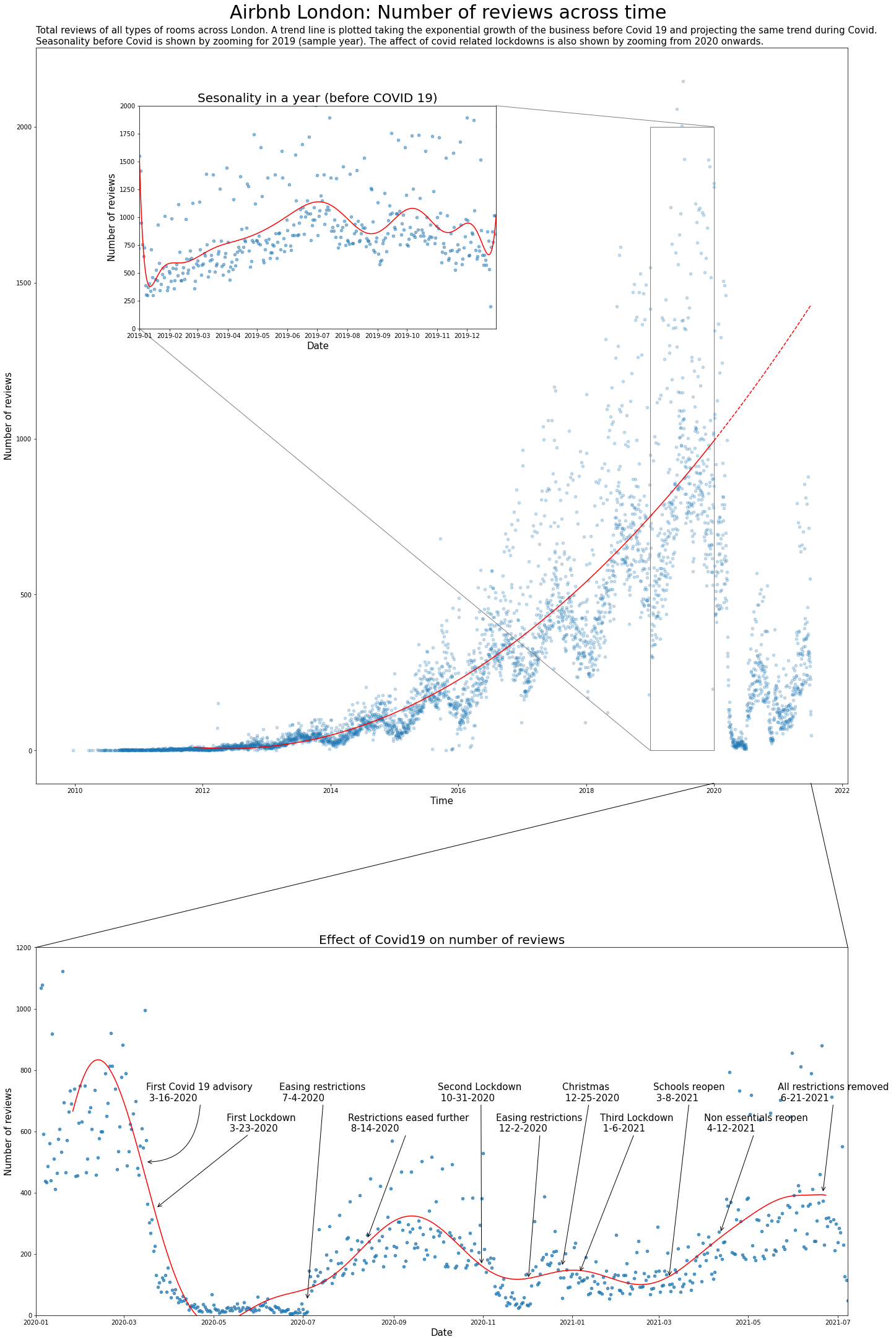
इस प्लॉट से, हम निम्नलिखित देख सकते हैं:
1. समय के साथ समीक्षाओं में परिवर्तन और महामारी से पहले का ट्रेंड कैद किया गया है। ट्रेंड को 2020-21 में बढ़ने के लिए बढ़ाया गया है, जो दिखाता है कि अगर महामारी नहीं होती तो वृद्धि होती।
2. डेटा में मौसमी प्रभाव को एक नमूना वर्ष में सेमांटिक ज़ूमिंग द्वारा दिखाया गया है। हम देख सकते हैं कि Airbnb जुलाई, सितंबर और जनवरी में अधिक लोकप्रिय है।
3. हम महामारी के प्रभाव को समीक्षाओं की संख्या पर भी देख सकते हैं। हम 2020 के पहले कुछ महीनों में एक तेज गिरावट देख सकते हैं, और फिर लॉकडाउन और उद्घाटन ने कुल समीक्षाओं की संख्या को कैसे प्रभावित किया।
Sunburst और pie charts
अब हम डेटा में गहराई से जाएंगे और उन प्रकार की लिस्टिंग और स्थानों को देखेंगे जिन्होंने इस वृद्धि में योगदान दिया है। पूर्ण listings डेटा सेट को इंपोर्ट करते हैं।
listing_detailed = pd.read_csv('listings.csv.gz')
pd.options.display.max_columns = None # to show all the columns
listing_detailed.head()
| id | listing_url | scrape_id | last_scraped | name | description | neighborhood_overview | picture_url | host_id | host_url | host_name | host_since | host_location | host_about | host_response_time | host_response_rate | host_acceptance_rate | host_is_superhost | host_thumbnail_url | host_picture_url | host_neighbourhood | host_listings_count | host_total_listings_count | host_verifications | host_has_profile_pic | host_identity_verified | neighbourhood | neighbourhood_cleansed | neighbourhood_group_cleansed | latitude | longitude | property_type | room_type | accommodates | bathrooms | bathrooms_text | bedrooms | beds | amenities | price | minimum_nights | maximum_nights | minimum_minimum_nights | maximum_minimum_nights | minimum_maximum_nights | maximum_maximum_nights | minimum_nights_avg_ntm | maximum_nights_avg_ntm | calendar_updated | has_availability | availability_30 | availability_60 | availability_90 | availability_365 | calendar_last_scraped | number_of_reviews | number_of_reviews_ltm | number_of_reviews_l30d | first_review | last_review | review_scores_rating | review_scores_accuracy | review_scores_cleanliness | review_scores_checkin | review_scores_communication | review_scores_location | review_scores_value | license | instant_bookable | calculated_host_listings_count | calculated_host_listings_count_entire_homes | calculated_host_listings_count_private_rooms | calculated_host_listings_count_shared_rooms | reviews_per_month | |
|---|---|---|---|---|---|---|---|---|---|---|---|---|---|---|---|---|---|---|---|---|---|---|---|---|---|---|---|---|---|---|---|---|---|---|---|---|---|---|---|---|---|---|---|---|---|---|---|---|---|---|---|---|---|---|---|---|---|---|---|---|---|---|---|---|---|---|---|---|---|---|---|---|---|---|
| 0 | 11551 | https://www.airbnb.com/rooms/11551 | 20210706215658 | 2021-07-08 | Arty and Bright London Apartment in Zone 2 | Unlike most rental apartments my flat gives yo... | Not even 10 minutes by metro from Victoria Sta... | https://a0.muscache.com/pictures/b7afccf4-18e5... | 43039 | https://www.airbnb.com/users/show/43039 | Adriano | 2009-10-03 | London, England, United Kingdom | Hello, I'm a friendly Italian man with a posit... | within an hour | 100% | 85% | f | https://a0.muscache.com/im/pictures/user/5f182... | https://a0.muscache.com/im/pictures/user/5f182... | Brixton | 0.0 | 0.0 | ['email', 'phone', 'reviews', 'jumio', 'offlin... | t | t | London, United Kingdom | Lambeth | NaN | 51.46095 | -0.11758 | Entire apartment | Entire home/apt | 4 | NaN | 1 bath | 1.0 | 3.0 | ["Hot water", "Hair dryer", "Smoke alarm", "Fi... | $99.00 | 2 | 1125 | 2.0 | 2.0 | 1125.0 | 1125.0 | 2.0 | 1125.0 | NaN | t | 0 | 30 | 58 | 290 | 2021-07-08 | 193 | 1 | 0 | 2011-10-11 | 2018-04-29 | 4.57 | 4.62 | 4.58 | 4.78 | 4.85 | 4.53 | 4.52 | NaN | f | 3 | 3 | 0 | 0 | 1.63 |
| 1 | 13913 | https://www.airbnb.com/rooms/13913 | 20210706215658 | 2021-07-08 | Holiday London DB Room Let-on going | My bright double bedroom with a large window h... | Finsbury Park is a friendly melting pot commun... | https://a0.muscache.com/pictures/miso/Hosting-... | 54730 | https://www.airbnb.com/users/show/54730 | Alina | 2009-11-16 | London, England, United Kingdom | I am a Multi-Media Visual Artist and Creative ... | within a few hours | 100% | 100% | f | https://a0.muscache.com/im/users/54730/profile... | https://a0.muscache.com/im/users/54730/profile... | LB of Islington | 3.0 | 3.0 | ['email', 'phone', 'facebook', 'reviews', 'off... | t | t | Islington, Greater London, United Kingdom | Islington | NaN | 51.56861 | -0.11270 | Private room in apartment | Private room | 2 | NaN | 1 shared bath | 1.0 | 0.0 | ["Host greets you", "Dryer", "Hot water", "Sha... | $65.00 | 1 | 29 | 1.0 | 1.0 | 29.0 | 29.0 | 1.0 | 29.0 | NaN | t | 30 | 60 | 90 | 365 | 2021-07-08 | 21 | 0 | 0 | 2011-07-11 | 2011-09-13 | 4.85 | 4.79 | 4.84 | 4.79 | 4.89 | 4.63 | 4.74 | NaN | f | 2 | 1 | 1 | 0 | 0.17 |
| 2 | 15400 | https://www.airbnb.com/rooms/15400 | 20210706215658 | 2021-07-08 | Bright Chelsea Apartment. Chelsea! | Lots of windows and light. St Luke's Gardens ... | It is Chelsea. | https://a0.muscache.com/pictures/428392/462d26... | 60302 | https://www.airbnb.com/users/show/60302 | Philippa | 2009-12-05 | Kensington, England, United Kingdom | English, grandmother, I have travelled quite ... | NaN | NaN | NaN | f | https://a0.muscache.com/im/users/60302/profile... | https://a0.muscache.com/im/users/60302/profile... | Chelsea | 1.0 | 1.0 | ['email', 'phone', 'reviews', 'jumio', 'govern... | t | t | London, United Kingdom | Kensington and Chelsea | NaN | 51.48780 | -0.16813 | Entire apartment | Entire home/apt | 2 | NaN | 1 bath | 1.0 | 1.0 | ["Dryer", "Hot water", "Shampoo", "Hair dryer"... | $75.00 | 10 | 50 | 10.0 | 10.0 | 50.0 | 50.0 | 10.0 | 50.0 | NaN | t | 0 | 14 | 44 | 319 | 2021-07-08 | 89 | 0 | 0 | 2012-07-16 | 2019-08-10 | 4.79 | 4.84 | 4.88 | 4.87 | 4.82 | 4.93 | 4.73 | NaN | t | 1 | 1 | 0 | 0 | 0.81 |
| 3 | 17402 | https://www.airbnb.com/rooms/17402 | 20210706215658 | 2021-07-08 | Superb 3-Bed/2 Bath & Wifi: Trendy W1 | You'll have a wonderful stay in this superb mo... | Location, location, location! You won't find b... | https://a0.muscache.com/pictures/39d5309d-fba7... | 67564 | https://www.airbnb.com/users/show/67564 | Liz | 2010-01-04 | Brighton and Hove, England, United Kingdom | We are Liz and Jack. We manage a number of ho... | within a day | 70% | 90% | f | https://a0.muscache.com/im/users/67564/profile... | https://a0.muscache.com/im/users/67564/profile... | Fitzrovia | 18.0 | 18.0 | ['email', 'phone', 'reviews', 'jumio', 'offlin... | t | t | London, Fitzrovia, United Kingdom | Westminster | NaN | 51.52195 | -0.14094 | Entire apartment | Entire home/apt | 6 | NaN | 2 baths | 3.0 | 3.0 | ["Dryer", "Hot water", "Shampoo", "Hair dryer"... | $307.00 | 4 | 365 | 4.0 | 4.0 | 365.0 | 365.0 | 4.0 | 365.0 | NaN | t | 6 | 6 | 17 | 218 | 2021-07-08 | 43 | 1 | 1 | 2011-09-18 | 2019-11-02 | 4.69 | 4.80 | 4.68 | 4.66 | 4.66 | 4.85 | 4.59 | NaN | f | 15 | 15 | 0 | 0 | 0.36 |
| 4 | 17506 | https://www.airbnb.com/rooms/17506 | 20210706215658 | 2021-07-08 | Boutique Chelsea/Fulham Double bed 5-star ensuite | Enjoy a chic stay in this elegant but fully mo... | Fulham is 'villagey' and residential – a real ... | https://a0.muscache.com/pictures/11901327/e63d... | 67915 | https://www.airbnb.com/users/show/67915 | Charlotte | 2010-01-05 | London, England, United Kingdom | Named best B&B by The Times. Easy going hosts,... | NaN | NaN | NaN | f | https://a0.muscache.com/im/users/67915/profile... | https://a0.muscache.com/im/users/67915/profile... | Fulham | 3.0 | 3.0 | ['email', 'phone', 'jumio', 'selfie', 'governm... | t | t | London, United Kingdom | Hammersmith and Fulham | NaN | 51.47935 | -0.19743 | Private room in townhouse | Private room | 2 | NaN | 1 private bath | 1.0 | 1.0 | ["Air conditioning", "Carbon monoxide alarm", ... | $150.00 | 3 | 21 | 3.0 | 3.0 | 21.0 | 21.0 | 3.0 | 21.0 | NaN | t | 29 | 59 | 89 | 364 | 2021-07-08 | 0 | 0 | 0 | NaN | NaN | NaN | NaN | NaN | NaN | NaN | NaN | NaN | NaN | f | 2 | 0 | 2 | 0 | NaN |
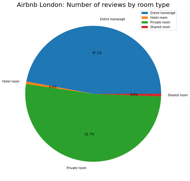
कमरे के प्रकार और स्थान के अनुसार समीक्षाओं की संख्या को देखते हुए, हमारे पास है:
listing_detailed.groupby('room_type').\
    aggregate({'number_of_reviews':'sum'}).\
    plot.pie(y='number_of_reviews', figsize=(10, 10),
             autopct='%1.1f%%' # to add the percentages text
            )
plt.ylabel("")
plt.title("Airbnb London: Number of reviews by room type", fontsize=20)
plt.show()
# Function to combine last few classes ito one class
total_other_reviews = 0
def combine_last_n(df):
    df1 = df.copy()
    global total_other_reviews
    total_other_reviews = (sum(df[df.number_of_reviews <= 5000].number_of_reviews))
    df1.loc[df.number_of_reviews <= 10000, 'number_of_reviews'] = 0
    return df1.number_of_reviews


listing_detailed.groupby('neighbourhood_cleansed').\
    aggregate({'number_of_reviews':'sum'}).\
    sort_values('number_of_reviews', ascending = False).\
    assign(no_reviews_alt = combine_last_n).\
    append(pd.Series({'number_of_reviews': 0, 'no_reviews_alt':total_other_reviews}, name='Others')).\
    plot.pie(y='no_reviews_alt', figsize=(10, 10), legend=None, rotatelabels=True,
             wedgeprops=dict(width=.5) # for donut shape
            )
plt.ylabel("")
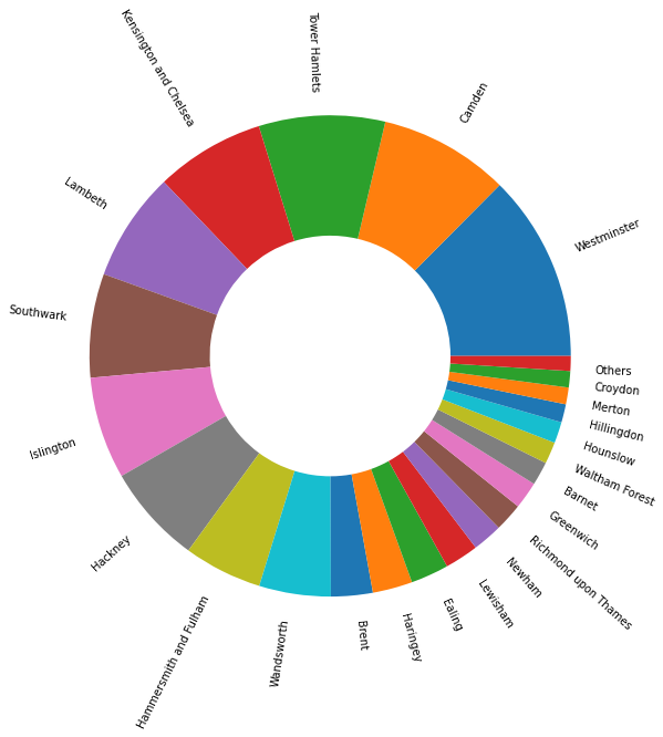
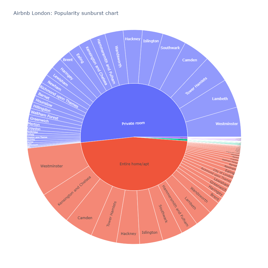
हम देख सकते हैं कि प्राइवेट रूम सबसे लोकप्रिय है जिसमें सबसे अधिक समीक्षाएं हैं, इसके बाद पूरा घर/अपार्टमेंट है। अन्य अप्रासंगिक हैं। इसी तरह, वेस्टमिंस्टर और कैम्बडेन लंदन में शीर्ष दो स्थान हैं। एक सनबर्स्ट चार्ट का उपयोग करके, हम इन दोनों को एक साथ देख सकते हैं।
listings_sunburst = listing_detailed.groupby(['room_type', 'neighbourhood_cleansed']).\
    aggregate({'number_of_reviews':'sum'}).\
    sort_values('number_of_reviews', ascending = False).reset_index()

fig = px.sunburst(listings_sunburst, path=['room_type', 'neighbourhood_cleansed'], values='number_of_reviews',
                  hover_data = ['room_type', 'number_of_reviews'], hover_name = 'neighbourhood_cleansed',
                 title = 'Airbnb London: Popularity sunburst chart', width = 900, height = 900)
fig.show()
Parallel Coordinates
इस चार्ट से, हम देख सकते हैं कि वेस्टमिंस्टर सभी कमरे के प्रकारों के लिए सबसे लोकप्रिय स्थान है, दूसरे और तीसरे लोकप्रिय स्थान विभिन्न कमरे के प्रकारों के लिए अलग हैं। चलिए केंसिंग्टन और चेल्सी का उदाहरण लेते हैं, हम इस क्षेत्र की हर कमरे के प्रकार में रैंकिंग देख सकते हैं।
top_20_names = list(listings_sunburst.sort_values('number_of_reviews', ascending = False).head(30)['neighbourhood_cleansed'])

listings_sunburst_wide = listings_sunburst.\
    pivot(index='neighbourhood_cleansed', columns='room_type', values='number_of_reviews').reset_index()
listings_sunburst_wide = listings_sunburst_wide.replace(np.nan, 0)

fig = px.parallel_coordinates(
    listings_sunburst_wide
)

# add the pink line to highlight Kensington
fig.data[0]['dimensions'][0]['constraintrange'] = [50000, 60000]

fig.update_layout(title_text='Kensington and Chelsea (in blue) popularity ranking across room types', title_x=0.7, title_y = 0.05)

fig.show()
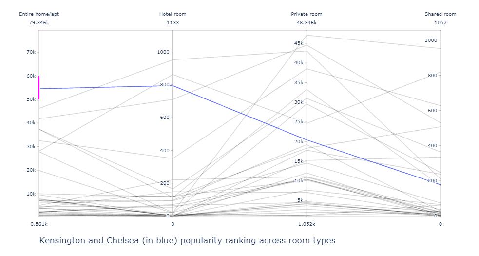
इस चार्ट से हम देख सकते हैं कि केंसिंग्टन (नीले रंग में हाइलाइट किया गया) 'Entire Home Apartment' के लिए शीर्ष 2 में है जबकि यह साझा कमरे के लिए शीर्ष 5 में नहीं है। यह चार्ट, साथ ही ऊपर का सनबर्स्ट, दिखाता है कि विभिन्न कमरे के प्रकारों के लिए कौन से स्थान लोकप्रिय हैं।
Bar chart और Steam graphs
इस लोकप्रियता के अनुपात में समय के साथ कैसे बदलाव आता है? इसे देखने का एक तरीका स्टैक्ड बार चार्ट का उपयोग करना है।
reviews_detailed = pd.merge(listing_detailed[['id', 'neighbourhood_cleansed', 'room_type']], reviews, left_on = 'id', right_on = 'listing_id')
fs, axs = plt.subplots(1, figsize=(15,10))
reviews_detailed['year'] = reviews_detailed.date.dt.year
reviews_detailed.groupby(['year', 'room_type']).\
    aggregate({'listing_id':'count'}).\
    unstack().reset_index().\
    plot.bar(x = 'year', y = 'listing_id', ax = axs, stacked = True)
plt.title('Popularity of different rooms across the years', fontsize = 25)
plt.legend(loc='upper right', title="Type of room", fontsize='medium',fancybox=True)
axs.set_ylabel('Number of reviews', fontsize=20)
axs.set_xlabel('Years', fontsize=20)

plt.show()
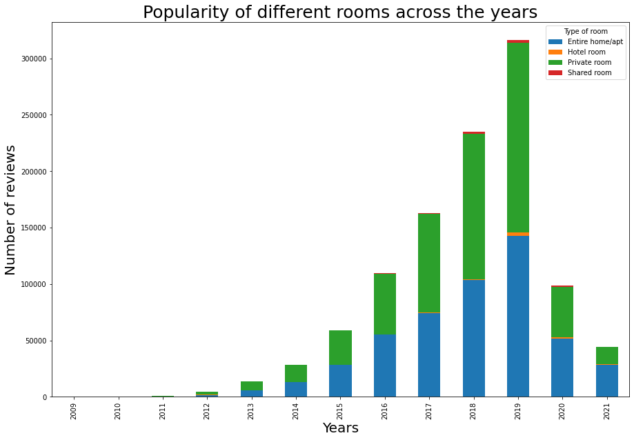
इस बार चार्ट से हम वही वृद्धि देख सकते हैं जो हमने स्कैटर प्लॉट में देखी थी, यानी 2019 तक एक गुणात्मक वृद्धि, और महामारी के कारण एक बाद की गिरावट। इसे देखने का एक और अच्छा तरीका स्ट्रीमग्राफ के माध्यम से है। स्ट्रीमग्राफ में, हम वर्गों के भीतर मौसमी प्रभाव देख सकते हैं।
fs, ax = plt.subplots(1, figsize=(15,10))
reviews_room = reviews_detailed.groupby(['date', 'room_type']).\
    aggregate({'listing_id':'count'}).\
    unstack().reset_index()
reviews_room.columns = ['date', 'Entire home/apt', 'Hotel room', 'Private room', 'Shared room']
ax.stackplot(reviews_room.date,
            list(reviews_room[['Entire home/apt', 'Hotel room', 'Private room', 'Shared room']].fillna(0).\
                 to_numpy().transpose()),
            baseline='wiggle')
plt.title('Popularity of different rooms across the years', fontsize=20, y=1.05,loc='left')
ax.text("2010",1050,'Streamgraph of the number of reviews across time',ha='left', fontsize=12)

plt.legend(['Entire home/apt', 'Hotel room', 'Private room', 'Shared room'], loc='upper left', title="Type of room")
ax.set_xlabel('Years', fontsize=20)

plt.show()
Heatmap
कौन से स्थान बेहतर हैं, और कौन से स्थानों को अपनी रेटिंग में सुधार करना चाहिए? हम स्थान के भीतर हर मेज़बान के लिए रेटिंग का औसत निकालकर स्थान के औसत रेटिंग को खोज सकते हैं।
location_rating = listing_detailed.groupby(['neighbourhood_cleansed', 'room_type']).\
    aggregate({'review_scores_rating':'mean'}).unstack().reset_index()
location_rating.columns = ['neighbourhood', 'Entire home/apt', 'Hotel room', 'Private room', 'Shared room']
location_rating.index = location_rating.neighbourhood
औसत रेटिंग को विज़ुअलाइज़ करने के लिए एक हीटमैप का उपयोग करने के कुछ तरीके हैं।
fig, ax = plt.subplots(figsize=[20,len(location_rating)/3.3])
sns.heatmap(data=location_rating[['Entire home/apt', 'Hotel room', 'Private room', 'Shared room']],
            annot=False, cbar_kws={"shrink":0.5,"orientation":'vertical'},linewidths=0.004,linecolor='grey',vmin=0,vmax=5, center = 0.25)

plt.show()
हालांकि यह हीटमैप हमें प्रत्येक जिले के लिए औसत रेटिंग प्रदान करता है, हम स्पष्टता के लिए निम्नलिखित विवरण और जोड़ सकते हैं:
1. लंदन में जिले का स्थान (जैसे: केंद्रीय लंदन)
2. प्रत्येक स्थान के भीतर सबसे अच्छे से लेकर सबसे खराब रेटेड जिलों तक व्यवस्थित
3. स्केल और मानव रेटिंग मनोविज्ञान के आधार पर उचित रंग चयन: औसत मानव रेटिंग 2.5 से नीचे का मतलब खराब रेटिंग है और 4.5 से ऊपर का मतलब बहुत अच्छी रेटिंग है (5 में से)। नकारात्मक-पॉजिटिव संबंध को प्रदर्शित करने के लिए एक विभाजन लाल-हरे स्केल का उपयोग करना अधिक स्वाभाविक है।
def add_regions(df, borough_col_name):
    """
    This function takes as input a dataframe with a column which includes London's borough name
    Then returns the same dataframw with sub regions names added for each borough
    """
    central = ['Camden', 'City of London', 'Kensington and Chelsea', 'Islington', 'Lambeth', 'Southwark', 'Westminster']
    east = ['Barking and Dagenham', 'Bexley', 'Greenwich', 'Hackney', 'Havering', 'Lewisham', 'Newham', 'Redbridge', 'Tower Hamlets', 'Waltham Forest']
    north = ['Barnet', 'Enfield', 'Haringey']
    south = ['Bromley', 'Croydon', 'Kingston upon Thames', 'Merton', 'Sutton', 'Wandsworth']
    west = ['Brent', 'Ealing', 'Hammersmith and Fulham', 'Harrow', 'Richmond upon Thames', 'Hillingdon', 'Hounslow']


    df['sub_regions'] = np.where((df[borough_col_name] == central[0]) |
                                       (df[borough_col_name] == central[1]) |
                                       (df[borough_col_name] == central[2]) |
                                       (df[borough_col_name] == central[3]) |
                                       (df[borough_col_name] == central[4]) |
                                       (df[borough_col_name] == central[5]) |
                                       (df[borough_col_name] == central[6])
                                       , 'Central', 'no')

    df['sub_regions'] = np.where((df[borough_col_name] == east[0]) |
                                       (df[borough_col_name] == east[1]) |
                                       (df[borough_col_name] == east[2]) |
                                       (df[borough_col_name] == east[3]) |
                                       (df[borough_col_name] == east[4]) |
                                       (df[borough_col_name] == east[5]) |
                                       (df[borough_col_name] == east[6]) |
                                       (df[borough_col_name] == east[7]) |
                                       (df[borough_col_name] == east[8]) |
                                       (df[borough_col_name] == east[9])
                                       , 'East', df['sub_regions'])

    df['sub_regions'] = np.where((df[borough_col_name] == north[0]) |
                                       (df[borough_col_name] == north[1]) |
                                       (df[borough_col_name] == north[2])
                                       , 'North', df['sub_regions'])

    df['sub_regions'] = np.where((df[borough_col_name] == south[0]) |
                                       (df[borough_col_name] == south[1]) |
                                       (df[borough_col_name] == south[2]) |
                                       (df[borough_col_name] == south[3]) |
                                       (df[borough_col_name] == south[4]) |
                                       (df[borough_col_name] == south[5])
                                       , 'South', df['sub_regions'])

    df['sub_regions'] = np.where((df[borough_col_name] == west[0]) |
                                       (df[borough_col_name] == west[1]) |
                                       (df[borough_col_name] == west[2]) |
                                       (df[borough_col_name] == west[3]) |
                                       (df[borough_col_name] == west[4]) |
                                       (df[borough_col_name] == west[5]) |
                                       (df[borough_col_name] == west[6])
                                       , 'West', df['sub_regions'])

    return df
def sort_data(df):
    """
    Groups the data by location and sorts the data based on average rating within the location.
    Different locations are sorted by average rating.
    """
    df1 = df.copy()
    df1['average_rating'] = (df1['Entire home/apt']+ df1['Hotel room'] + df1['Private room']+df1['Shared room'])/4
    df1['location_average'] = df1.groupby('sub_regions')['average_rating'].transform('mean')
    df1 = df1.sort_values(['location_average', 'average_rating'], ascending=False)
    return df1[['Private room', 'Entire home/apt', 'Hotel room', 'Shared room', 'sub_regions']]

def prepare_reg_annotation_lists():
    """
    Creates the annotation in the form of groups within the data. Displays this on the right hand side of the heatmap.
    """
    reg_sorted_list = location_rating.sub_regions.unique()
    reg_len = location_rating.sub_regions.value_counts().to_dict()

    sorted_len = []
    cum_len = []
    arrow_style_str_list = []

    # here we define the width of the bracket used, which is proportional to the number of boroughs within a sub region
    for i in range(5):
        if i==0:
            value = reg_len[reg_sorted_list[i]]
            cum_value = value
        else:
            value = reg_len[reg_sorted_list[i]]
            cum_value += value

        sorted_len.append(value)
        cum_len.append(cum_value)
        arrow_style_str_list.append('-[,widthB='+str((value/1.2)-0.5)+',lengthB=0.7')

    # here we define ticks which represent the center location of each sub region relative to the heatmap
    Ticks = []
    for i in range(5):
        if i == 0:
            Ticks.append(1-((cum_len[i]/2)/33))
        else:
            Ticks.append(1-((((cum_len[i]-cum_len[i-1])/2)+cum_len[i-1])/33))

    return Ticks,arrow_style_str_list,reg_sorted_list


location_rating = location_rating.replace(np.nan, 2.5)
location_rating = add_regions(location_rating, 'neighbourhood')
location_rating = sort_data(location_rating)
Ticks_h,arrow,region = prepare_reg_annotation_lists()
एक विभाजन लाल-हरे पैलेट को अच्छे समीक्षाओं और खराब समीक्षाओं का प्रतिनिधित्व करने के लिए चुना गया है।
red_green_cmap = sns.diverging_palette(10, 133,as_cmap=True)
red_green_cmap

fig, ax = plt.subplots(figsize=[20,len(location_rating)/3.3])
sns.heatmap(data=location_rating[['Private room', 'Entire home/apt', 'Hotel room', 'Shared room']],
            annot=False, cbar_kws={"shrink":0.5,"orientation":'vertical'},linewidths=0.004,linecolor='grey',vmin=2.25,vmax=4.75,
           cmap = red_green_cmap)
plt.title("Average ratings for different locations in London", fontsize=20, y=1.1,loc='left')
plt.text(0,-1,'Heatmap depicting the ratings among different locations in London. If no rating is available, minimum rating of 2.5 is assumed. \n Good ratings are ratings above 3.5 while bad ratings are below. The data is grouped by location (right) and sorted by average rating.',ha='left', fontsize=12)
ax.set_ylabel('')

#annotation for the borough
for i in range(5):
    ax.annotate(region[i],xy=(1.01,Ticks_h[i]), xytext=(1.02,Ticks_h[i]), xycoords='axes fraction',
                ha='left',va='center', arrowprops=dict(arrowstyle=arrow[i],lw=1))
हम देख सकते हैं कि रेटिंग प्राइवेट रूम और पूरे घर के लिए अच्छी हैं। प्रत्येक क्षेत्र में सबसे अच्छा स्थान है:
- पश्चिम: रिचमंड अपॉन थेम्स
- केंद्रीय: कैम्बडेन
- उत्तर: एनफील्ड
- पूर्व: हैकनी
- दक्षिण: क्रॉयडन
Treemap
इस संदर्भ में, विभिन्न स्थानों की रेटिंग की तुलना करना उचित नहीं है क्योंकि हमने देखा है कि उनकी लोकप्रियता अलग है। इसलिए एक स्थान में 10 समीक्षाएं हो सकती हैं जबकि दूसरे में 100 समीक्षाएं हो सकती हैं। उन्हें संयोजित करने के लिए, हम एक ट्रेमैप का उपयोग कर सकते हैं।
reviews_treemap = listing_detailed.groupby(['neighbourhood_cleansed']).\
    aggregate({'review_scores_rating':'mean', 'number_of_reviews':'sum'}).reset_index()
reviews_treemap = add_regions(reviews_treemap, 'neighbourhood_cleansed')

#change col names for nice viz on hover
reviews_treemap.columns = ['neighbourhood', 'Average Reviews', 'Number of reviews', 'regions']
fig = px.treemap(reviews_treemap, path=[px.Constant("London"), 'regions', 'neighbourhood'], values='Number of reviews',
           color = 'Average Reviews', color_continuous_scale='RdBu')
fig.update_layout(margin = dict(t=50, l=25, r=25, b=25))
fig.update_layout(title_text='Airbnb London: Ratings overview')
Word cloud
अब जब हमने रेटिंग को अच्छे और खराब रेटिंग में वर्गीकृत कर लिया है, चलिए इन रेटिंग में टेक्स्ट को देखते हैं और यह पहचानते हैं कि क्या कोई पैटर्न हैं।
reviews_detailed_text = pd.merge(listing_detailed[['id', 'description','neighborhood_overview', 'host_about', 'review_scores_rating']], reviews, left_on = 'id', right_on = 'listing_id')
reviews_detailed_positive_text = reviews_detailed_text[reviews_detailed_text.review_scores_rating > 3.75]
reviews_detailed_negative_text = reviews_detailed_text[reviews_detailed_text.review_scores_rating <= 3.75]
सकारात्मक और नकारात्मक सेट के लिए प्रत्येक 100 यादृच्छिक समीक्षाओं का चयन करते हैं।
pos_reviews_text = reviews_detailed_positive_text.sample(n=100, random_state = 2).comments.str.cat()
neg_reviews_text = reviews_detailed_negative_text.sample(n=100, random_state = 3).comments.str.cat()
सकारात्मक समीक्षाओं के लिए वर्ड क्लाउड
# !pip install wordcloud
from wordcloud import WordCloud, STOPWORDS, ImageColorGenerator
from PIL import Image
mask_pos = np.array(Image.open('thumbs-up-xxl.png'))

# word cloud, good vs bad ratings
stop_words = ["https", "co", "RT", 'br', '<br>', '<br/>', '\r', 'r'] + list(STOPWORDS)
wordcloud_pattern = WordCloud(stopwords = stop_words, background_color="white", max_words=2000, max_font_size=256,
               random_state=42, mask = mask_pos, width=mask_pos.shape[1], height=mask_pos.shape[0])
wordcloud_positive = wordcloud_pattern.generate(pos_reviews_text)

plt.imshow(wordcloud_positive, interpolation='bilinear')
plt.axis("off")
plt.show()

नकारात्मक समीक्षाओं के लिए वर्ड क्लाउड
mask_neg = np.array(Image.open('thumbs-down-xxl.png'))

# word cloud, good vs bad ratings
wordcloud_pattern = WordCloud(stopwords = stop_words, background_color="white", max_words=2000, max_font_size=256,
               random_state=42, mask = mask_neg, width=mask_neg.shape[1], height=mask_neg.shape[0])
wordcloud_neg = wordcloud_pattern.generate(neg_reviews_text)

plt.imshow(wordcloud_neg, interpolation='bilinear')
plt.axis("off")
plt.show()

सकारात्मक और नकारात्मक समीक्षाओं को एक प्लॉट में मिलाकर अंतर की तुलना करें:
fs, axs = plt.subplots(1, 2, figsize=(20,10))
plt.suptitle("Airbnb London: Wordcloud of positive and negative reviews", fontsize=20)
plt.figtext(0.5, 0.925, 'Wordcloud derived from a random sample of 100 positive and 100 negative reviews.',
            wrap=True, horizontalalignment='center', fontsize=12)

axs[0].imshow(wordcloud_positive, interpolation='bilinear')
axs[0].axis("off")

axs[1].imshow(wordcloud_neg, interpolation='bilinear')
axs[1].axis("off")

plt.show()
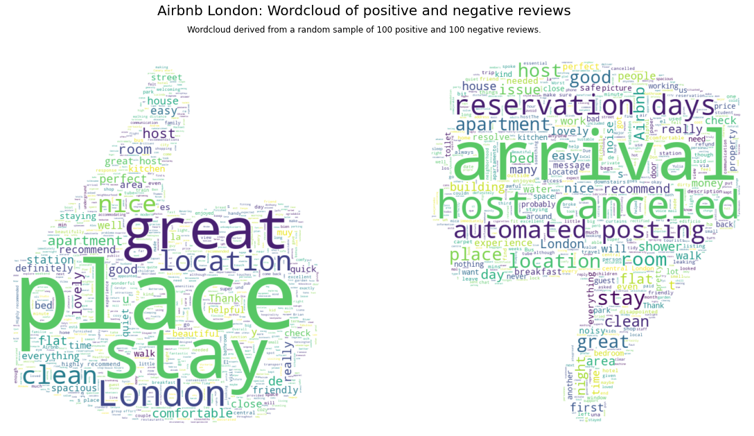
इन प्लॉट्स से, हम देख सकते हैं कि स्वचालित पोस्टिंग, मेज़बानों द्वारा रद्दीकरण, और आगमन के दौरान समस्याएं मुख्य मुद्दे हैं जिन पर Airbnb को ध्यान देना चाहिए।
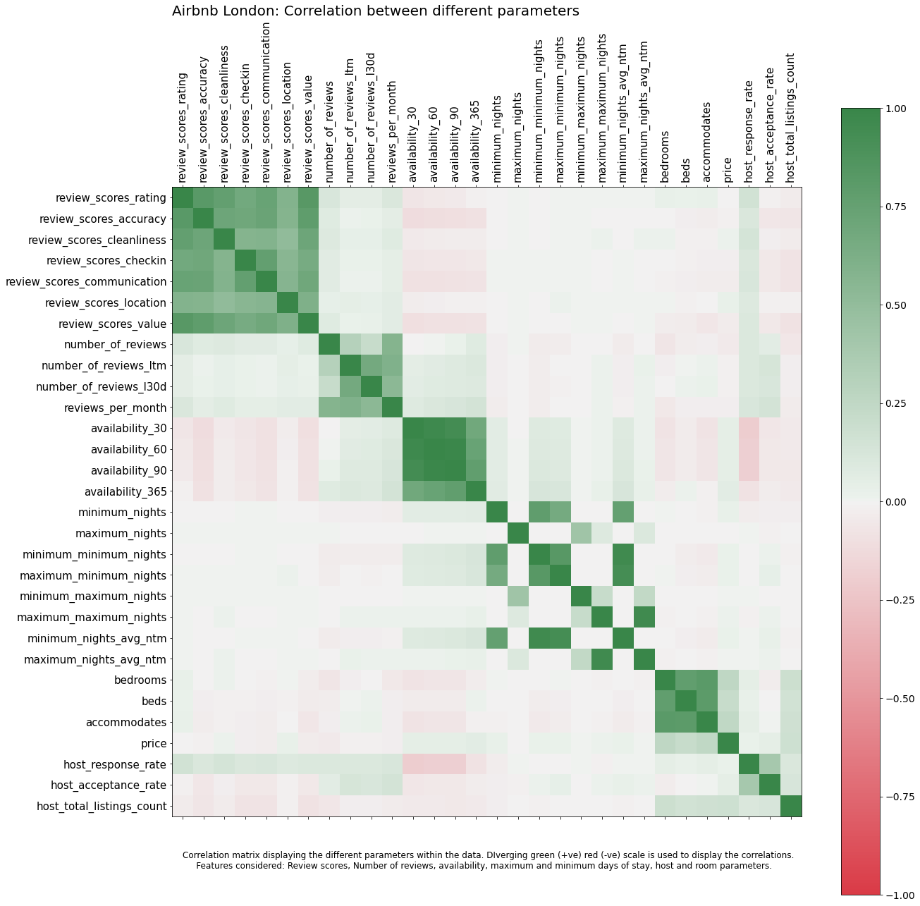
Correlation matrix
डेटा के भीतर विभिन्न पैरामीटर कैसे संबंधित हैं। रेटिंग्स की उपलब्धता या अधिकतम रातों के साथ कैसे संबंध है? इसे एक संबंध प्लॉट का उपयोग करके समझाया जा सकता है।
listing_detailed['host_response_rate'] = listing_detailed['host_response_rate'].str.replace('%', '').astype(float)
listing_detailed['host_acceptance_rate'] = listing_detailed['host_acceptance_rate'].str.replace('%', '').astype(float)
listing_detailed['price'] = listing_detailed['price'].str.replace('$', '').str.replace(',', '').astype(float)
col_for_corr = ['review_scores_rating', 'review_scores_accuracy', 'review_scores_cleanliness', 'review_scores_checkin', 'review_scores_communication', 'review_scores_location', 'review_scores_value',
                'number_of_reviews', 'number_of_reviews_ltm', 'number_of_reviews_l30d', 'reviews_per_month',
                'availability_30', 'availability_60', 'availability_90', 'availability_365',
                'minimum_nights', 'maximum_nights', 'minimum_minimum_nights', 'maximum_minimum_nights', 'minimum_maximum_nights', 'maximum_maximum_nights', 'minimum_nights_avg_ntm', 'maximum_nights_avg_ntm',
                'bedrooms', 'beds','accommodates', 'price',
                'host_response_rate', 'host_acceptance_rate', 'host_total_listings_count']


f = plt.figure(figsize=(20, 20))
plt.matshow(listing_detailed[col_for_corr].corr(), fignum = f, cmap = red_green_cmap, vmin=-1, vmax=1)
plt.xticks(range(listing_detailed[col_for_corr].select_dtypes(['number']).shape[1]),
           listing_detailed[col_for_corr].select_dtypes(['number']).columns, rotation=90, fontsize = 15)
plt.yticks(range(listing_detailed[col_for_corr].select_dtypes(['number']).shape[1]),
           listing_detailed[col_for_corr].select_dtypes(['number']).columns, rotation=0, fontsize = 15)
cb = plt.colorbar()
cb.ax.tick_params(labelsize=14)
plt.title("Airbnb London: Correlation between different parameters", fontsize=20,loc='left')
plt.text(0,32,'Correlation matrix displaying the different parameters within the data. DIverging green (+ve) red (-ve) scale is used to display the correlations.\n \
    Features considered: Review scores, Number of reviews, availability, maximum and minimum days of stay, host and room parameters.',
         ha='left', fontsize=12)

plt.show()
Scatterplot matrix
जबकि ऊपर का प्लॉट विभिन्न वेरिएबल्स के बीच संबंध दिखाता है, मैं रेटिंग्स में मूल्य परिवर्तन को गहराई से देखना चाहता हूं। मैं इसे एक स्कैटरप्लॉट मैट्रिक्स का उपयोग करके विज़ुअलाइज़ कर सकता हूं। इसके अतिरिक्त, मैं सबसे महंगे प्रॉपर्टीज और सबसे लोकप्रिय लेकिन सस्ती प्रॉपर्टीज को एनोटेट करना चाहता हूं।
def annotate_plot(x, y, **kwargs):

    if(x.name == 'price' and y.name == 'review_scores_rating'):
        ax = plt.gca()
        for index, obj in listing_detailed.nlargest(2, 'price').iterrows():
            plt.annotate(
                obj['name'], # the text
                xy=(obj.price, obj.review_scores_rating),
                xytext=(7500, obj.review_scores_rating-0.5),
                arrowprops=dict(arrowstyle="->")
            )
    elif(x.name == 'price' and y.name == 'number_of_reviews'):
        ax = plt.gca()
        for index, obj in listing_detailed.nlargest(3, 'number_of_reviews').iterrows():
            ax.text(obj.price, obj.number_of_reviews, obj['name'])
col_for_pairplot = ['review_scores_rating', 'number_of_reviews',  'price']

sns_plot = sns.pairplot(listing_detailed, vars = col_for_pairplot,  kind='scatter',  hue = 'room_type', diag_kind='kde',)
sns_plot.fig.set_size_inches(20, 20)
sns_plot._legend.set_bbox_to_anchor((0.15, 0.89))
sns_plot.map_upper(annotate_plot)
sns_plot.fig.suptitle("Airbnb London: Scatterplot matrix", fontsize = 20, y=1)
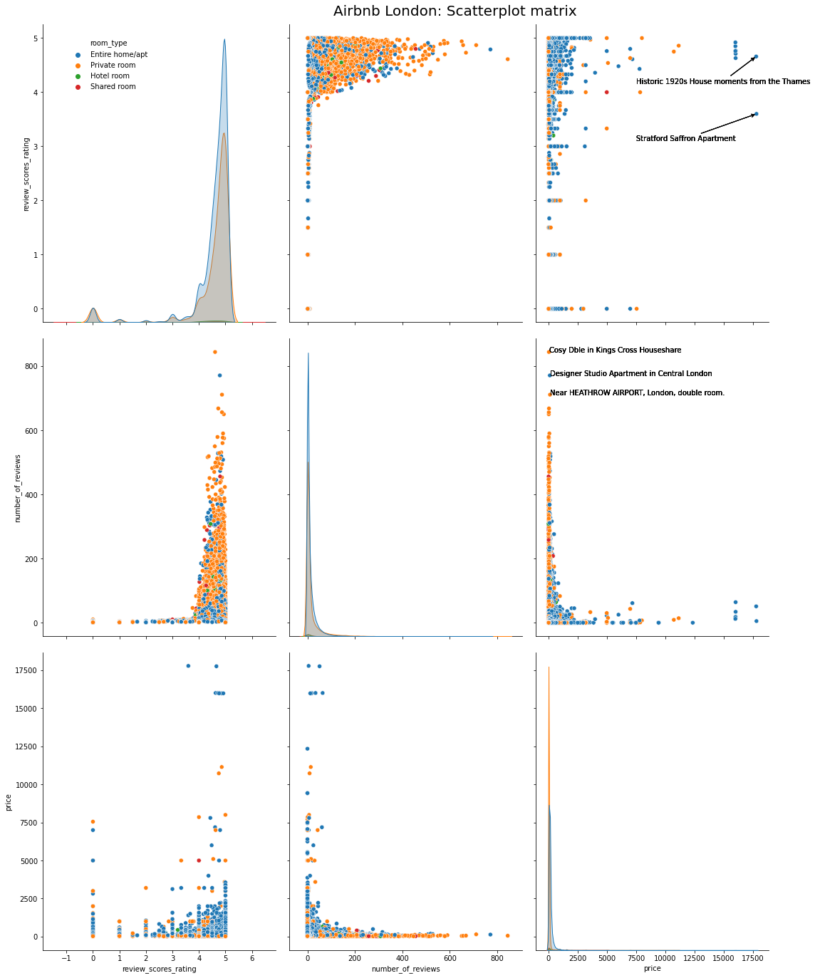
हम देख सकते हैं कि दो सबसे महंगी प्रॉपर्टीज या तो ऐतिहासिक अपार्टमेंट या एक हवेली हैं। तीन सबसे लोकप्रिय लेकिन सस्ती प्रॉपर्टीज छोटे और आकर्षक प्रॉपर्टीज हैं जो लोकप्रिय स्थलों के पास हैं।
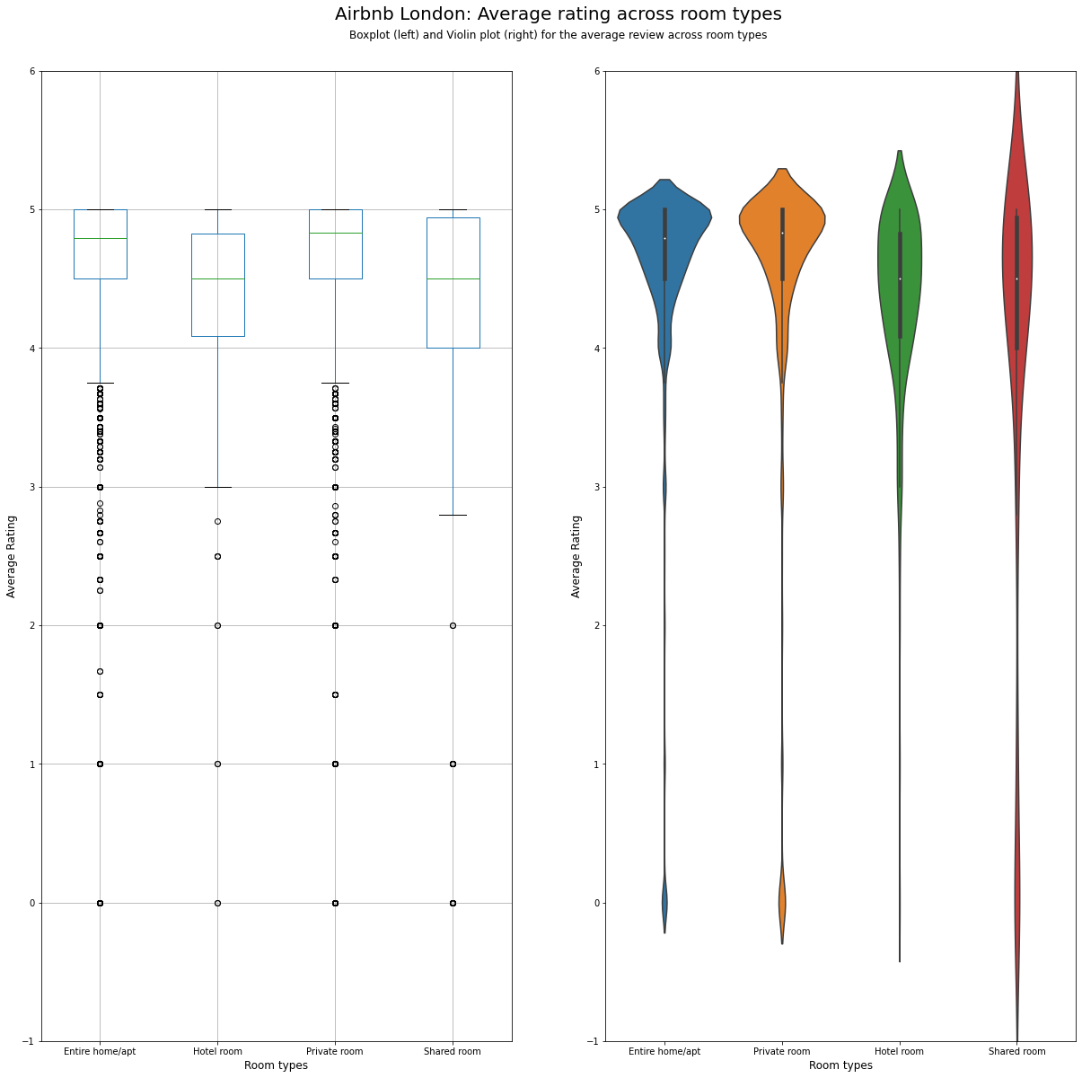
Boxplot और Violin chart
कमरे के विभिन्न प्रकारों में रेटिंग में परिवर्तन को देखने के लिए, हम या तो बॉक्सप्लॉट या वायलिन प्लॉट का उपयोग कर सकते हैं जैसा कि दिखाया गया है।
fs, axs = plt.subplots(1, 2, figsize=(20,20))
listing_detailed.boxplot(column = 'review_scores_rating', by = 'room_type', figsize = (10,20), ax = axs[0])
sns.violinplot('room_type','review_scores_rating', data=listing_detailed, ax = axs[1])
plt.suptitle("Airbnb London: Average rating across room types", fontsize = 20, y=0.95)

plt.figtext(0.5, 0.925, 'Boxplot (left) and Violin plot (right) for the average review across room types',
            wrap=True, horizontalalignment='center', fontsize=12)

axs[0].set_title('')

for ax in axs:
    ax.set_ylim(-1, 6)
    ax.set_ylabel('Average Rating', fontsize=12)
    ax.set_xlabel('Room types', fontsize=12)
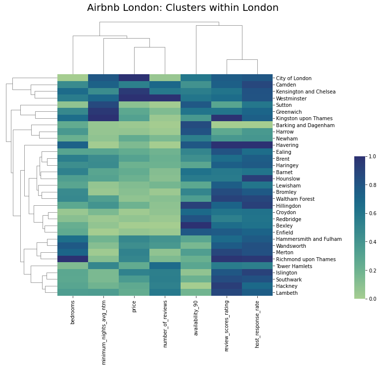
Cluster map
यदि हम कुछ विशेषताओं के आधार पर स्थानीयताओं को क्लस्टर करना चाहते हैं, तो क्लस्टर मैप सबसे अच्छा विकल्प है। नीचे के मैप में, हम विभिन्न स्थानों को एक प्रकार की प्रत्येक विशेषता के आधार पर क्लस्टर करते हैं। विशेषताओं को भी क्लस्टर किया जाता है ताकि डेटा के भीतर समानता दिखाई दे। अंततः, हम डेटा में भिन्नता को प्रदर्शित करने के लिए एक सफेद-नीला रंग पैलेट का उपयोग करते हैं।
from sklearn.preprocessing import MinMaxScaler
import seaborn as sns
col_for_corr = [ 'price', 'review_scores_rating', 'number_of_reviews', 'availability_90', 'minimum_nights_avg_ntm', 'bedrooms',
                'host_response_rate']

df_cluster = listing_detailed.groupby('neighbourhood_cleansed').aggregate({
    'review_scores_rating':'mean',
    'number_of_reviews':'sum',
    'availability_90':'mean',
    'minimum_nights_avg_ntm':'mean',
    'bedrooms':'mean',
    'price':'mean',
    'host_response_rate':'mean'
}).reset_index()

scaler = MinMaxScaler()
df_cluster1 = pd.DataFrame(scaler.fit_transform(df_cluster[col_for_corr]), columns=col_for_corr)
df_cluster1.index = df_cluster.neighbourhood_cleansed
crest_cmap = sns.color_palette("crest", as_cmap=True)
crest_cmap

g = sns.clustermap(df_cluster1, cmap = crest_cmap, vmin = 0, vmax = 1)
plt.title("Airbnb London: Clusters within London", fontsize=20,loc='left', y = 2, x = -25)
g.ax_cbar.set_position((1, .2, .03, .4))
g.ax_heatmap.set_ylabel("")

plt.show()
References
- Visualisation Analytics and Design, Tamara Munzner
- Class notes and assignments, Visualisation module, MSc Business Analytics, Imperial College London, Class 2020-22
- Ahmed Khedr, Ankit Mahajan, Harsha Achyuthuni, Shaked Atia Report: Visualizing demand,supply,prices and ratings for Airbnb in London
- Visual Analytics lab at JKU Linz