Call Center Operations को Probability Distributions के साथ Model करना
Call centers एक dynamic environment में operate करते हैं जहाँ:
1. Customer calls पूरे दिन randomly आती हैं।
2. Agents issues को अलग-अलग success rates के साथ resolve करते हैं।
3. Waiting times traffic और staffing के आधार पर fluctuate करते हैं।
ये characteristics call centres को probability distributions apply करने के लिए एक बेहतरीन real-world example बनाती हैं। Call arrivals, waiting times, और resolution patterns को model करके, हम:
1. Workload और staffing needs का अनुमान लगा सकते हैं।
2. Service levels को optimise कर सकते हैं।
3. Customer experience metrics को समझ सकते हैं।
इस ब्लॉग में, हम queueing theory और service analytics में widely used तीन key distributions पर ध्यान देंगे:
1. Poisson Distribution – Fixed time interval में arriving calls की संख्या को model करने के लिए।
2. Exponential Distribution – Consecutive calls के बीच का समय model करने के लिए।
3. Geometric Distribution – Successful resolution से पहले failed attempts की संख्या model करने के लिए।
इसके बाद, हम Goodness-of-Fit tests का पता लगाएंगे और Central Limit Theorem को validate करेंगे।
import os
import numpy as np
import pandas as pd
import matplotlib.pyplot as plt
import seaborn as sns
from scipy import stats
import kagglehub

plt.style.use("seaborn-v0_8")
sns.set_context("talk")
Data Kaggle से है Call center dataset
# Data download करें
path = kagglehub.dataset_download("akash1vishwakarma/call-center-dataset")

df = pd.read_excel(path+'/01 Call-Center-Dataset.xlsx')
df.columns = [c.strip().replace(" ", "_").replace("(Y/N)", "YN") for c in df.columns]
df
| Call_Id | Agent | Date | Time | Topic | Answered_YN | Resolved | Speed_of_answer_in_seconds | AvgTalkDuration | Satisfaction_rating | |
|---|---|---|---|---|---|---|---|---|---|---|
| 0 | ID0001 | Diane | 2021-01-01 | 09:12:58 | Contract related | Y | Y | 109.0 | 00:02:23 | 3.0 |
| 1 | ID0002 | Becky | 2021-01-01 | 09:12:58 | Technical Support | Y | N | 70.0 | 00:04:02 | 3.0 |
| 2 | ID0003 | Stewart | 2021-01-01 | 09:47:31 | Contract related | Y | Y | 10.0 | 00:02:11 | 3.0 |
| 3 | ID0004 | Greg | 2021-01-01 | 09:47:31 | Contract related | Y | Y | 53.0 | 00:00:37 | 2.0 |
| 4 | ID0005 | Becky | 2021-01-01 | 10:00:29 | Payment related | Y | Y | 95.0 | 00:01:00 | 3.0 |
| ... | ... | ... | ... | ... | ... | ... | ... | ... | ... | ... |
| 4995 | ID4996 | Jim | 2021-03-31 | 16:37:55 | Payment related | Y | Y | 22.0 | 00:05:40 | 1.0 |
| 4996 | ID4997 | Diane | 2021-03-31 | 16:45:07 | Payment related | Y | Y | 100.0 | 00:03:16 | 3.0 |
| 4997 | ID4998 | Diane | 2021-03-31 | 16:53:46 | Payment related | Y | Y | 84.0 | 00:01:49 | 4.0 |
| 4998 | ID4999 | Jim | 2021-03-31 | 17:02:24 | Streaming | Y | Y | 98.0 | 00:00:58 | 5.0 |
| 4999 | ID5000 | Diane | 2021-03-31 | 17:39:50 | Contract related | N | N | NaN | NaN | NaN |
5000 rows × 10 columns
Dataset को Clean करना
Time variables को clean करें और timestamp के आधार पर sort करें।
# Date और time को clean करें और timestamp variable बनाएं
df['Date'] = pd.to_datetime(df['Date'], errors='coerce')
df['Time_td'] = pd.to_timedelta(df['Time'].astype(str)) # HH:MM:SS -> timedelta
df['timestamp'] = df['Date'] + df['Time_td']

# Events को timestamp के अनुसार sort करें। (सभी subsequent computations chronological order पर निर्भर करते हैं।)
df = df.dropna(subset=['timestamp']).sort_values('timestamp').reset_index(drop=True)
Flags को normalize करें
df['Answered_YN'] = df['Answered_YN'].apply(lambda x: 1 if x=='Y' else 0)
df['Resolved'] = df['Resolved'].apply(lambda x: 1 if x=='Y' else 0)
Durations को convert करें
1. Speed_of_answer_in_seconds को numbers में।
2. AvgTalkDuration “MM:SS/HH:MM:SS” को seconds में।
# Talk duration को seconds में parse करें
def parse_duration(s):
    if pd.isna(s): return np.nan
    try:
        h, m, s2 = 0, 0, 0
        parts = str(s).split(':')
        parts = [int(p) for p in parts]
        if len(parts) == 3: h, m, s2 = parts
        elif len(parts) == 2: m, s2 = parts
        else: return float(parts[0])
        return h*3600 + m*60 + s2
    except Exception:
        return np.nan

df['TalkDuration_seconds'] = df['AvgTalkDuration'].apply(parse_duration)

# Data type conversions
df['Speed_of_answer_in_seconds'] = pd.to_numeric(df['Speed_of_answer_in_seconds'], errors='coerce')
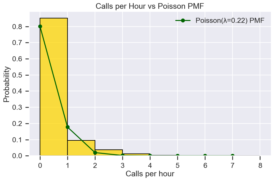
Poisson distribution (calls/day)
चलो सवाल पर विचार करते हैं: “अगले घंटे में कितनी calls आएंगी?”
Call arrivals आमतौर पर independent होती हैं और short intervals में relatively constant average rate पर होती हैं। यहाँ Poisson distribution विशेष रूप से उपयोगी है।
Definition
Poisson distribution उस probability को model करता है जब \(k\) events एक fixed interval में होते हैं जब events एक constant rate \(\lambda\) पर independently होते हैं।
# Calculate: counts/hour
hourly_counts = df.set_index('timestamp').groupby([pd.Grouper(freq='h'), 'Agent']).size().reset_index()
hourly_counts.columns = ['timestamp', 'Agent', 'no_of_calls']

# एक dataset बनाएं जिसमें agent-timestamp (hours) का सभी combination हो
df['dummy_col'] = 1
outer_join_df = df.groupby('Agent').dummy_col.max().reset_index().merge(
    df.groupby('timestamp').dummy_col.max().reset_index(), on='dummy_col')

# datasets को join करें ताकि complete dataset मिल सके
hourly_counts = outer_join_df.merge(hourly_counts, on=['timestamp', 'Agent'], how='outer')
hourly_counts['no_of_calls'] = hourly_counts.no_of_calls.fillna(0)

# Metrics
lambda_hat = hourly_counts.no_of_calls.mean()
var_hat = hourly_counts.no_of_calls.var(ddof=1)

# Sample lambda distribution
max_k = int(hourly_counts.no_of_calls.max())
k_vals = np.arange(0, max_k+1)
pmf = stats.poisson.pmf(k_vals, mu=lambda_hat)

# Distribution को plot करें
fig, ax = plt.subplots(figsize=(10,6))
sns.histplot(hourly_counts.no_of_calls, bins=np.arange(0, max_k+2), stat='probability', color="gold", ax=ax)
ax.plot(k_vals, pmf, 'o-', color="darkgreen", label=f"Poisson(λ={lambda_hat:.2f}) PMF")
ax.set_title('Calls per Hour vs Poisson PMF')
ax.set_xlabel('Calls per hour')
ax.legend()
plt.show();
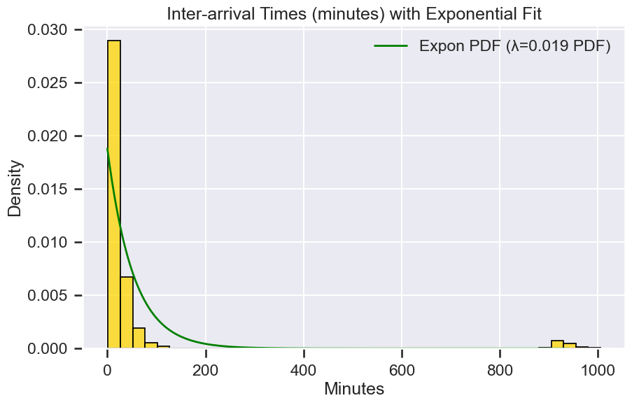
Exponential distribution (inter-arrival times)
अब, चलो जवाब देते हैं: “अगली call आने में कितना समय लगेगा?”
अगर calls एक Poisson process का पालन करती हैं, तो consecutive calls के बीच का समय memoryless होता है, मतलब अगले मिनट में call आने की probability इस बात पर निर्भर नहीं करती कि आप पहले से कितनी देर इंतज़ार कर चुके हैं। इसे Exponential distribution से model किया जाता है।
Definition Exponential distribution उस समय को model करता है जो एक Poisson process में events के बीच होता है: $$ PDF:= f(\lambda) = \lambda\times e^{-\lambda t} $$
जहाँ:
\(t\) = waiting time (उदाहरण के लिए, calls के बीच के मिनट),
\(\lambda\) = rate parameter (calls per minute)।
Key Properties 1. Mean waiting time = \(1/\lambda\). 2. Memoryless property: $ P(T > s + t \mid T > s) = P(T > t)$
Example
अगर calls के बीच का average time 53 मिनट है, तो:
$$ \hat{\lambda} = \frac{1}{50} = 0.02 \text{ per minute} $$ अगली call के 10 मिनट के भीतर आने की probability:
$$ P(T \le 10) = 1 - e^{-0.02 \times 10} \approx 0.18 $$
# Exponential: inter-arrival times
ts = df['timestamp'].sort_values().values
inter_arrival_sec = np.diff(ts) / np.timedelta64(1, 's')
inter_arrival_sec = inter_arrival_sec[inter_arrival_sec > 0]
inter_arrival_min = inter_arrival_sec / 60.0

# Metrics
lambda_exp_hat = 1.0 / np.mean(inter_arrival_min)

fig, ax = plt.subplots(figsize=(10,6))
sns.histplot(inter_arrival_min, bins=40, stat='density', color="gold", ax=ax)
x = np.linspace(0, np.percentile(inter_arrival_min, 99), 200)
ax.plot(x, stats.expon.pdf(x, scale=1/lambda_exp_hat), color="green", lw=2,
        label=f"Expon PDF (λ={lambda_exp_hat:.3f} PDF)")
ax.set_title('Inter-arrival Times (minutes) with Exponential Fit')
ax.set_xlabel('Minutes')
ax.legend()
plt.show();
Geometric Distribution (failures before first success)
मान लीजिए हम जानना चाहते हैं: “कितनी failed attempts होती हैं जब तक कोई issue resolve नहीं होता?”
Call centres में, कुछ issues को success पाने के लिए कई interactions की आवश्यकता होती है। प्रत्येक attempt को एक Bernoulli trial के रूप में model किया जा सकता है: या तो एक success या एक failure।
Definition
Geometric distribution पहले success से पहले failures की संख्या को model करता है:
$$ P(X=r)=p\times (1-p)^{r} $$
जहाँ r = 0,1,2,3,4,...
\(p\) = किसी भी attempt पर success की probability
\(r\) = success से पहले failures की संख्या
Example अगर एक attempt में issue को resolve करने की probability 0.73 है, तो success से पहले 2 failures की probability:
$$ P(X = 2) = (1 - 0.73)^2 \times 0.73 $$
Insights 1. p का उच्च मान यह दर्शाता है कि अधिकांश issues जल्दी resolve होते हैं।
2. कम p जटिल मामलों या training gaps को दर्शाता है।
# Failures before first success (per agent)

# प्रत्येक agent के chronological sequence of resolved flags के लिए, अगली Y (पहली success) से पहले N (failures) की संख्या गिनें।
geo_failures = []
for agent, grp in df.sort_values('timestamp').groupby('Agent'):
    seq = grp['Resolved'].dropna().values
    fail = 0
    for v in seq:
        if v == 1:
            geo_failures.append(fail)
            fail = 0
        elif v == 0:
            fail += 1

geo_failures = np.array(geo_failures)

# Agents के बीच “success से पहले failures” पर Geometric distribution को fit करें;
# success probability p (MLE via mean failures) का अनुमान लगाएं।
if len(geo_failures) > 0:
    mean_fail = float(np.mean(geo_failures))
    p_hat = 1.0 / (mean_fail + 1.0)
    k_max_g = int(np.percentile(geo_failures, 99))
    k_vals_g = np.arange(0, max(5, k_max_g)+1)
    pmf_geom = stats.geom.pmf(k_vals_g+1, p_hat)

    fig, ax = plt.subplots(figsize=(10,6))
    sns.histplot(geo_failures, bins=range(0, k_vals_g[-1]+2), stat='probability',
                 color="gold", ax=ax)
    ax.plot(k_vals_g, pmf_geom, 'o-', color="green", label=f"Geom(p={p_hat:.3f}) PMF (shifted)")
    ax.set_title('Failures before First Success vs Geometric PMF')
    ax.set_xlabel('Failures before success')
    ax.legend()
    plt.show();
इन Models से Operational Insights
इन distributions को call centre data पर लागू करके, हम:
1. Call volumes और waiting times का अनुमान लगा सकते हैं
2. Staffing और training को optimise कर सकते हैं
3. Data-driven decisions के माध्यम से customer satisfaction में सुधार कर सकते हैं।
Staffing और Scheduling
Poisson arrival rates मदद करती हैं प्रति घंटे अपेक्षित call volumes का forecast करने में। इसका उपयोग agent shifts की योजना बनाने के लिए करें और under- या over-staffing से बचें।
Service Level Agreements (SLAs)
Exponential waiting times हमें लंबी प्रतीक्षा की probability का अनुमान लगाने की अनुमति देती हैं। उदाहरण के लिए, अगर SLA का requirement है कि 30 सेकंड के भीतर answer करना है, तो compute करें:
$$ P(T \le 0.5 \text{ min}) = 1 - e^{-\lambda \times 0.5} $$
Quality और Training
Geometric distribution यह दर्शाती है कि resolution से पहले कितनी attempts की आवश्यकता होती है। उच्च failure streaks जटिल विषयों या agent skill gaps को दर्शाते हैं।
Customer Experience
इन models को combine करें ताकि queue performance का simulation किया जा सके:
1. Expected wait time,
2. Probability of abandonment,
3. Resolution likelihood on first attempt.
Chi-Square Tests के साथ Distribution Fits को Validate करना
जब हम एक theoretical distribution को real-world data पर fit करते हैं, तो हमें यह जांचने की आवश्यकता होती है कि मॉडल ने देखी गई frequencies को कितना अच्छी तरह explain किया है। एक सामान्य विधि Chi-Square Goodness-of-Fit (GOF) test है। यह test तुलना करता है:
1. Observed frequencies (आपके dataset से)।
2. Expected frequencies (fitted distribution से)।
Test statistic: $$ \chi^2 = \sum_{i=1}^{k} \frac{(O_i - E_i)^2}{E_i}$$ जहाँ: \(O_i\) = bin \(i\) में observed count,
\(E_i\) = bin \(i\) में expected count,
\(k\) = bins की संख्या।
Interpretation:
Null hypothesis \(H_0\): Data निर्दिष्ट distribution का पालन करता है।
Large \(\chi^2\) → poor fit.
p-value > 0.05 → \(H_0\) को reject करने में असफल (good fit)।
Chi-Square GOF के लिए Steps
1. Data को bin करें (bins को combine करें जिनकी expected count < 5 है)।
2. Observed और expected frequencies की गणना करें।
3. Python में scipy.stats.chisquare() लागू करें।
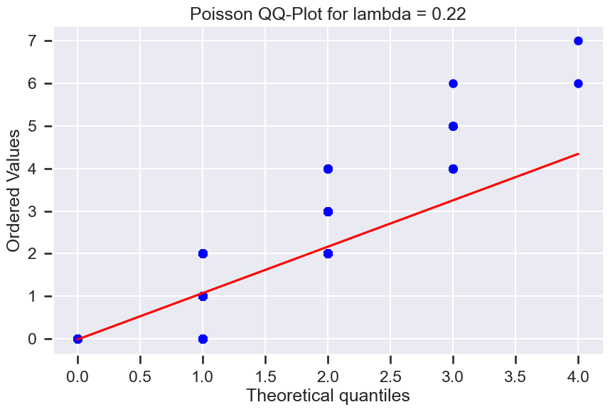
# Poisson distribution
chi2_stat_poisson, p_poisson = stats.chisquare(hourly_counts.groupby('no_of_calls').timestamp.count(),
f_exp=pmf*hourly_counts.no_of_calls.count())
print(f"Poisson Chi-Square p-value: {p_poisson:.4f}")
fig, ax = plt.subplots(figsize=(10,6))
res = stats.probplot(hourly_counts.no_of_calls, dist=stats.poisson,
sparams=(hourly_counts.no_of_calls.mean(),), plot=ax)
ax.set_title("Poisson QQ-Plot for lambda = "+str(round(hourly_counts.no_of_calls.mean(),2)))
plt.show();
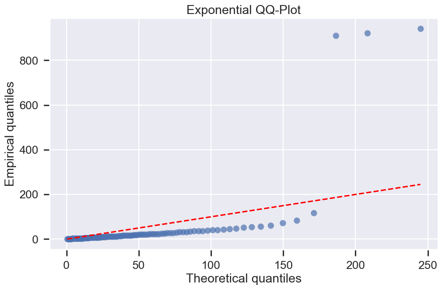
# Exponential distribution
s_D, ks_p = stats.kstest(inter_arrival_min, 'expon', args=(0, 1/lambda_exp_hat))
print(f"Exponential Kolmogorov-Smirnov test p-value: {p_poisson:.4f}")
fig, ax = plt.subplots(figsize=(10,6))
probs = np.linspace(0.01, 0.99, 99)
emp_q = np.quantile(inter_arrival_min, probs)
theo_q = stats.expon.ppf(probs, scale=1/lambda_exp_hat)
ax.plot(theo_q, emp_q, 'o', alpha=0.7)
ax.plot(theo_q, theo_q, 'r--', lw=2)
ax.set_title('Exponential QQ-Plot')
ax.set_xlabel('Theoretical quantiles')
ax.set_ylabel('Empirical quantiles')
plt.show();
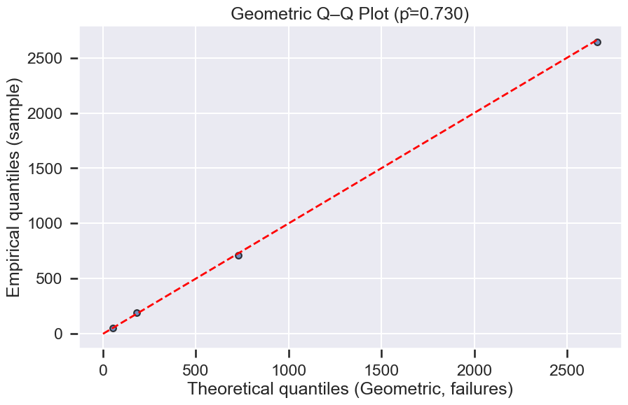
# Geometric distribution
n_fail = np.mean(geo_failures)
p_hat = 1 / (mean_fail + 1)
k_vals_g = np.arange(0, int(np.percentile(geo_failures, 99))+1)
pmf_geom = stats.geom.pmf(k_vals_g+1, p_hat)
emp_counts = pd.Series(geo_failures).value_counts().sort_index()
obs_g = np.array([emp_counts.get(k, 0) for k in k_vals_g])
exp_g = pmf_geom * obs_g.sum()
chi2_stat_geom, p_geom = stats.chisquare(obs_g, f_exp=exp_g*np.sum(obs_g)/np.sum(exp_g))
print(f"Geometric Chi-Square p-value: {p_geom:.4f}")
fig, ax = plt.subplots(figsize=(10,6))
ax.scatter(obs_g, exp_g, s=40, alpha=0.75, edgecolor='k')
max_q = max(obs_g.max(), exp_g.max())
ax.plot([0, max_q], [0, max_q], 'r--', lw=2)
ax.set_xlabel('Theoretical quantiles (Geometric, failures)')
ax.set_ylabel('Empirical quantiles (sample)')
ax.set_title(f'Geometric Q–Q Plot (p̂={p_hat:.3f})')
Poisson Chi-Square p-value: 0.0000
Exponential Kolmogorov-Smirnov test p-value: 0.0000
Geometric Chi-Square p-value: 0.7642


Text(0.5, 1.0, 'Geometric Q–Q Plot (p̂=0.730)')
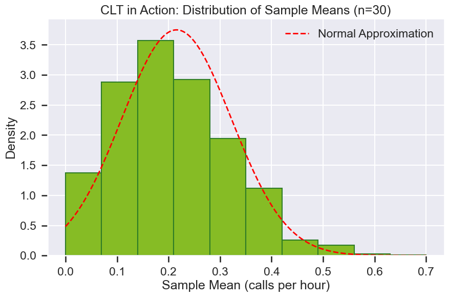
Central Limit Theorem
Central Limit Theorem कहता है:
जब आप किसी भी population से repeated samples लेते हैं और उनके means की गणना करते हैं, तो उन sample means का distribution एक normal distribution के करीब पहुंचता है जब sample size बढ़ता है—चाहे मूल population का आकार कुछ भी हो।
यह call centres के लिए क्यों महत्वपूर्ण है?
Call centre metrics जैसे call arrival counts per hour या average talk duration per agent अक्सर skewed या discrete distributions (Poisson, Exponential, आदि) का पालन करते हैं। लेकिन जब managers daily या weekly averages को देखते हैं, तो वे averages सामान्य दिखते हैं क्योंकि CLT के कारण।
Example: Calls per Hour
Individual hourly call counts एक Poisson distribution का पालन करते हैं (skewed, discrete)। अगर हम 30 घंटों के samples लेते हैं और उनके average call count की गणना करते हैं, और इसे कई बार दोहराते हैं:
1. इन sample means का histogram bell-shaped दिखेगा।
2. यह तब भी होता है जब मूल hourly counts सामान्य नहीं होते।
Visual Demonstration
1. Hourly call counts के dataset से शुरू करें।
2. 1,000 samples बनाएं, प्रत्येक का size \(n = 30\) घंटे।
3. प्रत्येक sample के लिए hourly calls का mean निकालें।
4. इन means का histogram plot करें, जो एक normal distribution का अनुमान लगाएगा।
sample_size = 30
n_samples = 1000

# Sample means generate करें
sample_means = []
for _ in range(n_samples):
    sample = np.random.choice(hourly_counts.no_of_calls, size=sample_size, replace=True)
    sample_means.append(sample.mean())

# Sample means का histogram plot करें
plt.figure(figsize=(10,6))
plt.hist(sample_means, bins=10, color="#86BC25", edgecolor='#2E7C26', density=True)
plt.title(f"CLT in Action: Sample Means का Distribution (n={sample_size})")
plt.xlabel("Sample Mean (calls per hour)")
plt.ylabel("Density")

# Normal curve overlay करें
mean = np.mean(sample_means)
std = np.std(sample_means)
x = np.linspace(min(sample_means), max(sample_means), 200)
plt.plot(x, stats.norm.pdf(x, loc=mean, scale=std), 'r--', lw=2, label="Normal Approximation")
plt.legend()
plt.show();