Multivariate Analysis (R)
Introduction
Multivariate EDA techniques generally show the relationship between two or more variables with the dependant variable in the form of either cross-tabulation, statistics or visually. In the current problem it will help us look at relationships between our data.
This blog is a part of in-time analysis problem. I want to analyse my entry time at office and understand what factors effect it.
After integrating Google Maps data with attendance dataset, I currently have the factors
1. date (month / week day / season etc)
2. main_activity (means of transport)
3. hours.worked (of the previous day)
4. travelling.time (time it took to travel from house to office)
5. home.addr (the place of residence)
The dependent variable is diff.in.time (difference between my actual in time vs policy in-time) A sample of the data is shown
| diff.in.time | date | main_activity | hours.worked | travelling.time | home.addr | diff.out.time |
|---|---|---|---|---|---|---|
| -9 | 2018-08-14 | IN_VEHICLE | 8.933333 | 900.719 | Old House | 5 |
| 17 | 2018-03-16 | ON_FOOT | 9.116667 | 930.126 | Old House | -10 |
| -14 | 2018-09-10 | ON_FOOT | 4.583333 | 1179.873 | Old House | -251 |
| -7 | 2018-10-19 | ON_BICYCLE | 9.583333 | 1501.060 | New House | 42 |
| -9 | 2018-06-28 | IN_VEHICLE | 9.783333 | 670.700 | Old House | 56 |
Cross-tabulation
For categorical data cross-tabulation is very useful. For two variables, cross-tabulation is performed by making a two-way table with column headings that match the levels of one variable and row headings that match the levels of the other variable, then filling in the counts of all subjects that share a pair of levels. The two variables might be both explanatory, both outcome, or one of each.
I am using Kable to make cool tables.
cross_table <- travel %>% group_by(home.addr, main_activity) %>%
  summarise(avg.travel.time = mean(travelling.time),
            avg.in.time.diff = mean(diff.in.time),
            median.in.time.diff =  median(diff.in.time)) %>%
  arrange(home.addr, main_activity)

library(kableExtra)
kable(cross_table, caption = 'Cross Tabulation') %>%
  kable_styling(full_width = F) %>%
  column_spec(1, bold = T) %>%
  collapse_rows(columns = 1:2, valign = "middle") %>%
  scroll_box()
| home.addr | main_activity | avg.travel.time | avg.in.time.diff | median.in.time.diff |
|---|---|---|---|---|
| New House | IN_VEHICLE | 1285.0264 | -1.800000 | -3 |
| New House | ON_BICYCLE | 1547.5557 | -4.000000 | -6 |
| New House | ON_FOOT | 1695.7091 | 5.285714 | 5 |
| Old House | IN_VEHICLE | 771.1752 | 2.857143 | -4 |
| Old House | ON_BICYCLE | 1029.6329 | 14.941176 | 18 |
| Old House | ON_FOOT | 1170.4783 | 17.433628 | 17 |
Scatter plots
Scatter plots show how much one variable is affected by another.
To see how travelling time affects in-time
ggplot(travel, aes(x=diff.in.time, y= travelling.time, color = main_activity)) +
  geom_point(show.legend = TRUE) +
  labs(x = 'In-time difference (Minutes)', y='Travelling time (seconds)',  title = "Travelling time vs in-time",
       color = 'Mode of transport') +
  theme_minimal()+theme(legend.position="bottom")
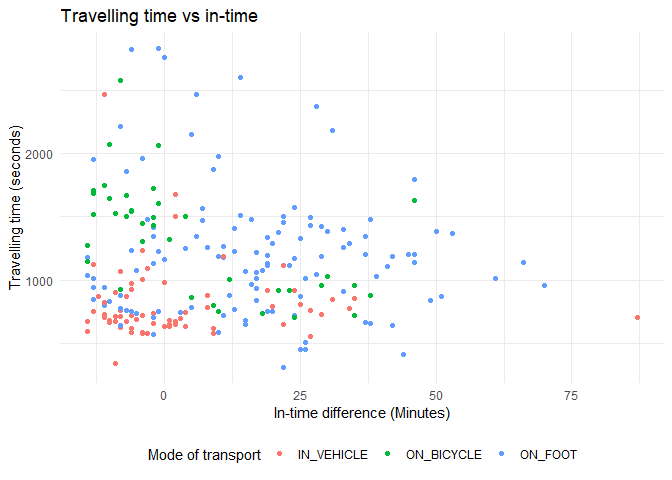
From the above graph, I can see that:
1. For bicycle, as travelling time decreases(low traffic) in-time difference increases(coming earlier to office)
2. There seems to be no relationship between travelling time (traffic) and in-time difference when on foot.
3. Travelling time has little affect on it-time difference when travelling on vehicle.
To see how hours worked(on previous day) affects in-time
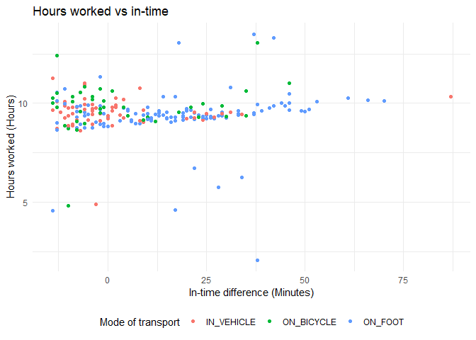
From the above graph, I can observe that irrespective of mode of transport, my in-time difference increases (coming earlier to office) as hours worked on the previous day increases.
Box plots
Similarly, I want to see how mode of transport affects in-time difference. For categorical variable, box plots display this information in the most ideal manner.
ggplot(travel, aes(x=main_activity, y= diff.in.time, group = main_activity)) +
  geom_boxplot() +
  labs(x='Mode of transport', y='In time difference (min)') +
  theme_minimal()
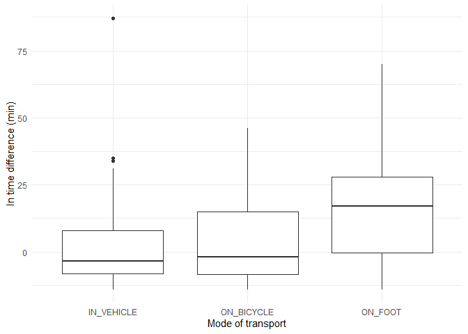
From the above graph, I can observe that:
1. On vehicle, I went to office on average, ~12 minutes after the policy in-time (in-time difference is -12)
2. On cycle, I went to office almost close to the policy in-time
3. While walking, I was almost always before the policy in-time
Similarly, for place of residence.

From this graph, I can understand that from New house I was close to ~5 minutes after the policy in-time while I used to be on-time while living in Old house.
Created using R Markdown.