ANOVA Test (R)
In this post, I would like to look into Anova hypothesis testing. The data-set I am going to use is published in https://smartcities.data.gov.in which is a Government of India project under the National Data Sharing and Accessibility Policy.
I want to analyse if the unemployment across Bangalore is similar or are there pockets with high unemployment. The Unemployment_Rate_Bengaluru.csv data set has total employed and unemployed people in Bangalore at a Ward level. For simplicity’s sake, I want to concentrate on three zones, Bangalore-east, Mahadevpura and Rajeshwari Nagar.
As I want to test that there is significant difference between unemployment rate in different zones in Bangalore, the null and alternate hypothesis will be as follows:
$$ H_0: \mu_{Bangalore-east} = \mu_{Mahadevpura} = \mu_{Rajeshwari-Nagar} $$
$$ H_1: Not\, all\, \mu\, are\, equal $$
Sample unemployment data set:
| cityName | zoneName | wardName | wardNo | unemployed.no | employed.no | total.labour | rate |
|---|---|---|---|---|---|---|---|
| Bengaluru | East | Manorayana Palya | 167 | 19011 | 13745 | 32756 | 0.5803822 |
| Bengaluru | East | Ganga Nagar | 154 | 18294 | 14346 | 32640 | 0.5604779 |
| Bengaluru | Mahadevapura | Basavanapura | 187 | 27146 | 22061 | 49207 | 0.5516695 |
| Bengaluru | Mahadevapura | Ramamurthy Nagar | 26 | 27085 | 20273 | 47358 | 0.5719203 |
| Bengaluru | East | Radhakrishna Temple Ward | 18 | 20081 | 15041 | 35122 | 0.5717499 |
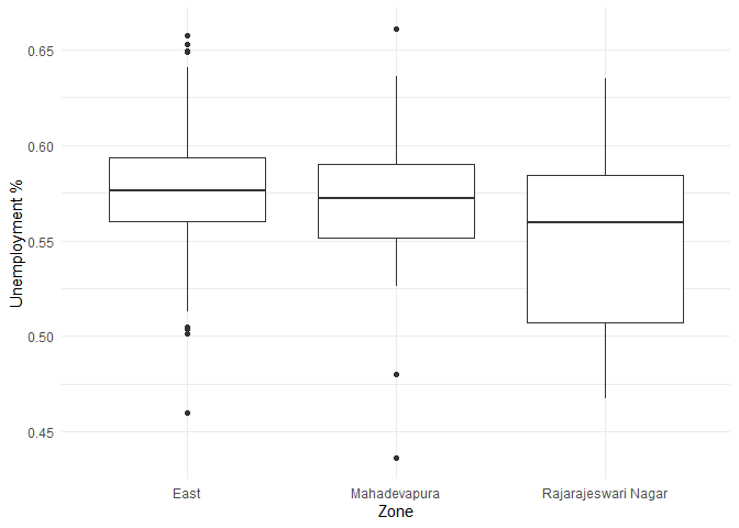
Visualizing the difference of unemployment in each zone.
ggplot(unemployment, aes(x=zoneName, y= rate, group = zoneName)) +
  geom_boxplot() +
  labs(x='Zone', y='Unemployment %') +
  theme_minimal()
The summary statistics of unemployment across different zones are as follows:
data.summary <- unemployment %>%
  rename(group = zoneName) %>%
  group_by(group) %>%
  summarise(count = n(),
            mean = mean(rate),
            sd = sd(rate),
            skewness = skewness(rate),
            kurtosis = kurtosis(rate))
data.summary
## # A tibble: 3 x 6
##   group               count  mean     sd skewness kurtosis
##   <chr>               <int> <dbl>  <dbl>    <dbl>    <dbl>
## 1 East                   81 0.574 0.0361 -0.228      0.747
## 2 Mahadevapura           24 0.567 0.0449 -0.812      1.69
## 3 Rajarajeswari Nagar    18 0.548 0.0499  0.00421   -1.24
From the above table I observe that the unemployment rate is between 54% and 57% in all the three zones.
One of the conditions to perform anova is that the population response variable follows a normal distribution in each group. The distribution of unemployment rate in different zones are:
ggplot() +
  geom_density(data=unemployment, aes(x=rate, group=zoneName, color=zoneName), adjust=2) +
  labs(x = 'Unemployment Rate', y='Density',  title = 'Testing normality among response variables') +
  theme_minimal()+theme(legend.position="bottom")
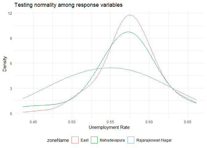
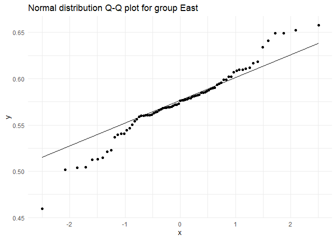
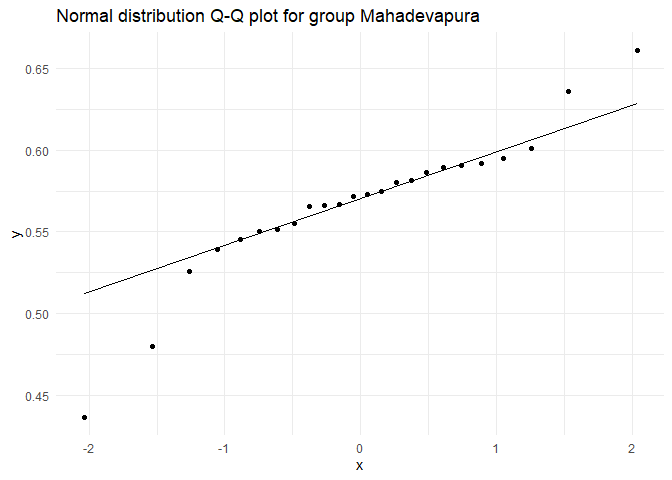
From the above graph, it looks like the three groups are normally distributed. To test for normality, we could use Shapiro-Wilk test.
The test for each group would have the following hypothesis:
\(H_0\): The unemployment rate in the group is normally distributed
\(H_1\): The unemployment rate in the group is not normally distributed
for(i in 1:nrow(data.summary)){
  test.dist <- (unemployment %>% dplyr::filter(zoneName == data.summary$group[i]))$rate
  cat('Testing for group ', data.summary$group[i], '\n')
  print(shapiro.test(test.dist))
  norm.plot <- ggplot() +
    geom_qq(aes(sample = test.dist)) +
    stat_qq_line(aes(sample = test.dist)) +
    ggtitle(paste0("Normal distribution Q-Q plot for group ",data.summary$group[i])) +
    theme_minimal()
  plot(norm.plot)
}
## Testing for group  East
##
##  Shapiro-Wilk normality test
##
## data:  test.dist
## W = 0.97147, p-value = 0.06734
## Testing for group  Mahadevapura
##
##  Shapiro-Wilk normality test
##
## data:  test.dist
## W = 0.90815, p-value = 0.03216
## Testing for group  Rajarajeswari Nagar
##
##  Shapiro-Wilk normality test
##
## data:  test.dist
## W = 0.95852, p-value = 0.5734
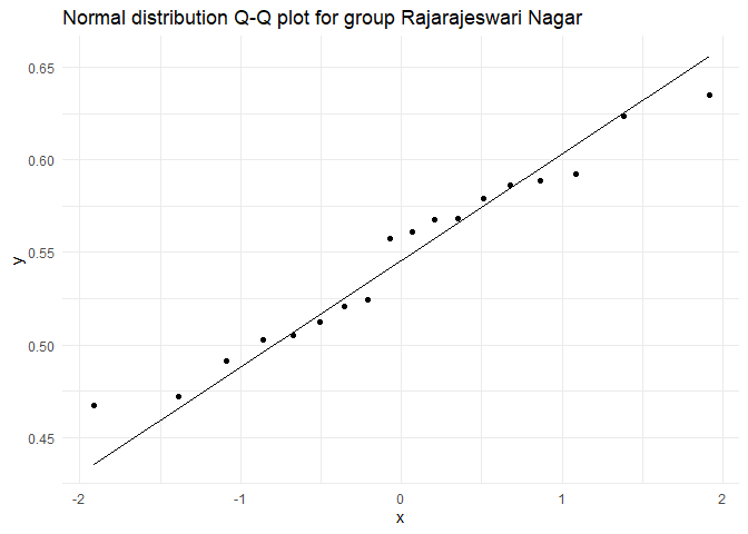
As \(p > \alpha\), where \(\alpha = 0.01\), retaining the Null hypothesis in all the three groups. Therefore, we can assume that unemployment rate is normally distributed among all groups.
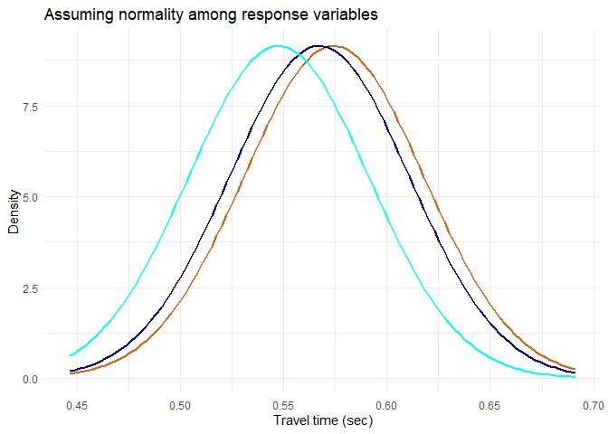
Another condition for anova is that the population variances are assumed to be same. This is an assumption I am willing to take at this point.
Taking these assumptions, the ideal distributions of the sample are as follows. These distributions can be compared to a simulation that I created where change in F value (and significance of anova) can be visualised by increasing the between variance (increasing the distance between group means)
plot.normal.groups <- function(data.summary, mean, sd, label, title){
  common.group.sd <- mean(data.summary$sd)
  range <- seq(mean-3*sd, mean+3*sd, by = sd*0.001)
  norm.dist <- data.frame(range = range, dist = dnorm(x = range, mean = mean, sd = sd))
  # Plotting sampling distribution and x_bar value with cutoff
  norm.aov.plot <- ggplot(data = norm.dist, aes(x = range,y = dist))
  for (i in 1:nrow(data.summary)) {
    norm.aov.plot <- norm.aov.plot +
      stat_function(fun = dnorm, color=colors()[sample(50:100, 1)],  size = 1,
                    args = list(mean = data.summary$mean[i], sd = common.group.sd))
  }
  norm.aov.plot + labs(x = label, y='Density',  title = title) +
      theme_minimal()+theme(legend.position="bottom")
}
set.seed(9)
mean <- mean(unemployment$rate)
sd <- sd(unemployment$rate)
plot.normal.groups(data.summary, mean, sd, 'Travel time (sec)', 'Assuming normality among response variables')
Performing Anova with
$$ H_0: \mu_{Bangalore-east} = \mu_{Mahadevpura} = \mu_{Rajeshwari-Nagar} $$
$$ H_1: Not\, all\, \mu\, are\, equal $$
# Functions used in anova-test

f.plot <- function(pop.mean=0, alpha = 0.05, f, df1, df2,
                              label = 'F distribution',title = 'Anova test'){
  # Creating a sample F distribution
  range <- seq(qf(0.0001, df1, df2), qf(0.9999, df1, df2), by = (qf(0.9999, df1, df2)-qf(0.0001, df1, df2))*0.001)
  f.dist <- data.frame(range = range, dist = df(x = range, ncp = pop.mean, df1 = df1, df2 = df2)) %>%
    dplyr::mutate(H0 = if_else(range <= qf(p = 1-alpha, ncp = pop.mean, df1 = df1,df2 = df2),'Retain', 'Reject'))
  # Plotting sampling distribution and F value with cutoff
  plot.test <- ggplot(data = f.dist, aes(x = range,y = dist)) +
    geom_area(aes(fill = H0)) +
    scale_color_manual(drop = TRUE, values = c('Retain' = "#00BFC4", 'Reject' = "#F8766D"), aesthetics = 'fill') +
    geom_vline(xintercept = f, size = 2) +
    geom_text(aes(x = f, label = paste0('F = ', round(f,3)), y = mean(dist)), colour="blue", vjust = 1.2) +
    labs(x = label, y='Density',  title = title) +
    theme_minimal()+theme(legend.position="bottom")
  plot(plot.test)
}
anva <- aov(rate ~ zoneName, unemployment)
anova.summary <- summary(anva)
print(anova.summary)
##              Df  Sum Sq  Mean Sq F value Pr(>F)
## zoneName      2 0.01065 0.005323   3.315 0.0397 *
## Residuals   120 0.19269 0.001606
## ---
## Signif. codes:  0 '***' 0.001 '**' 0.01 '*' 0.05 '.' 0.1 ' ' 1
f.plot(f = anova.summary[[1]]$F[1], df1 = anova.summary[[1]]$Df[1], df2 = anova.summary[[1]]$Df[2])
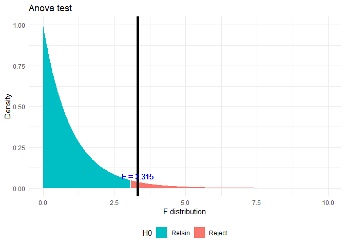
Here \(p < \alpha\), where \(\alpha = 0.05\) Hence rejecting the Null Hypothesis. From this test we can observe that not all groups have same mean. But to find out which groups are similar and which are different, I am conducting a TukeyHSD test.
tukey.test <- TukeyHSD(anva)
print(tukey.test)
##   Tukey multiple comparisons of means
##     95% family-wise confidence level
##
## Fit: aov(formula = rate ~ zoneName, data = unemployment)
##
## $zoneName
##                                          diff         lwr          upr
## Mahadevapura-East                -0.007071899 -0.02917267  0.015028872
## Rajarajeswari Nagar-East         -0.026768634 -0.05154855 -0.001988723
## Rajarajeswari Nagar-Mahadevapura -0.019696735 -0.04934803  0.009954561
##                                      p adj
## Mahadevapura-East                0.7285538
## Rajarajeswari Nagar-East         0.0309193
## Rajarajeswari Nagar-Mahadevapura 0.2597730
# Plot pairwise TukeyHSD comparisons and color by significance level
tukey.df <- as.data.frame(tukey.test$zoneName)
tukey.df$pair = rownames(tukey.df)
ggplot(tukey.df, aes(colour=cut(`p adj`, c(0, 0.01, 0.05, 1),
                           label=c("p<0.01","p<0.05","Non-Sig")))) +
  geom_hline(yintercept=0, lty="11", colour="grey30") +
  geom_errorbar(aes(pair, ymin=lwr, ymax=upr), width=0.2) +
  geom_point(aes(pair, diff)) +
  labs(x = 'Groups', y='Density',  colour="", title = 'Tukey HSD Test') +
    theme_minimal()+theme(legend.position="bottom")
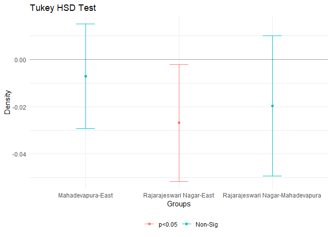
From this test we can see that there is significant difference (with \(\alpha = 0.05\) confidence) between Rajeshwari Nagar and Bangalore East.