Univariate Analysis (R)
Introduction
Uni-variate analysis is the simplest form of EDA. "Uni" means "one", so in other words your data has only one variable.
It doesn't deal with causes or relationships and it's major purpose is to describe; it takes data, summarizes that data and finds patterns in the data.
In describing or characterizing the observations of an individual variable, there are three basic properties that are of interest:
- The location of observations, or how large or small the values of the individual observations are
- The dispersion (sometimes called scale or spread) of the observations
- The distribution of the observations
Uni-variate plots provide one way to find out about those properties. There are two basic kinds of uni variate plots:
- Enumeration plots, or plots that show every observation
- Summary plots, that generalize the data into a simplified representation.
For the current tutorial, I will be using my office attendance data set. The data set contains the time when I swiped into office and the time when I swiped out of office. Data from 4th October 2017 to 29th November 2018.
After some manipulation on the data set, I will get the difference between policy out-time and my actual out-time. I can leave from 15 minutes before the policy out time. A sample of the data after manipulation is as follows: (Actual data is not shown for security reasons. This is mock data which is very similar to the actual one.)
##   Attendance.Date diff.in.time diff.out.time
## 1      2018-03-22      18 mins      226 mins
## 2      2018-08-14      -9 mins        5 mins
## 3      2017-12-04      42 mins       11 mins
## 4      2018-03-01      26 mins       -6 mins
## 5      2018-01-23      35 mins       -4 mins
Summary Statistics
Some basic summary statistics before further analysis would me the basic mean and standard deviation of the data. For this tutorial, I will use diff.in.time (difference between actual in-time and policy in-time)
mean(as.numeric(attendance$diff.out.time)) # Mean in minutes
## [1] 20.3227
sd(as.numeric(attendance$diff.out.time)) # Standard Deviation in minutes
## [1] 69.06549
nrow(attendance) # Length of the data set
## [1] 282
Enumerative plots
"Enumerative plots" are called such because they enumerate or show every individual data point
Index Plot/Univariate Scatter Diagram
Displays the values of a single variable for each observation using symbols plotted relative to the observation number.
ggplot(attendance, aes(x=Attendance.Date, y= as.numeric(diff.out.time), color = (diff.out.time >= -15))) +
  geom_point(show.legend = FALSE) +
  labs(x = 'Time', y='Out-time difference (Minutes)') +
  theme_minimal()
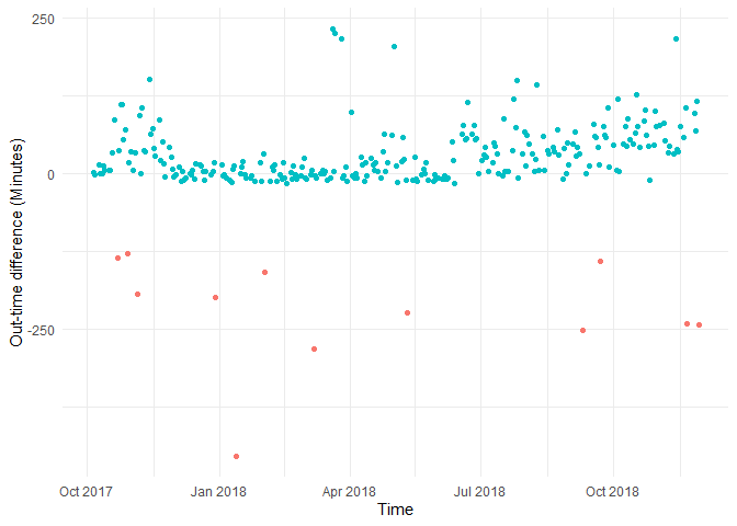
Just looking at this plot I can say the following:
- I could cluster into three parts, One cluster would be before December 2017, where I used to leave office way after my out-time, second cluster would be from December 2017 to June 2018, where I used to leave office 15 minutes before my out time, and after June 2018, when I was leaving way after my out-time.
- The red dots indicate the days when I came to office after 15 minutes from in-time. They are anomalies, days when I took half days etc.. We can exclude them from our current analysis.
Y Zero High-Density Plot
Another way to look at the same data is by using a Y Zero High-Density Plot. It displays the values of a single variable plotted as thin vertical lines. Here the magnitude of the observations are highlighted.
ggplot(attendance, aes(x=Attendance.Date, y = 0, color = (diff.out.time >= -15),
                       xend = Attendance.Date, yend = as.numeric(diff.out.time))) +
  geom_segment(show.legend = FALSE) +
  labs(x = 'Time', y='Out-time difference (Minutes)') +
  theme_minimal()
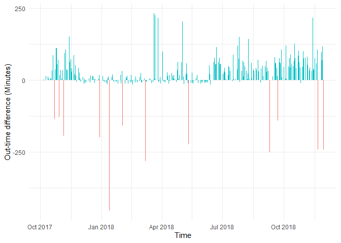
Removing half-days as outliers
attendance <- attendance %>%
  filter(diff.out.time >= -15)
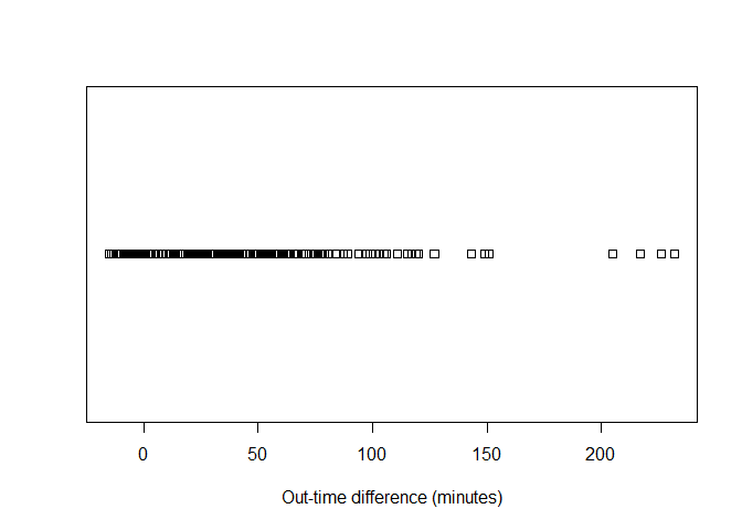
Strip Plot/Strip Chart (univariate scatter diagram)
Displays the values of a single variable as symbols plotted along a line. This is a basic plot where we can see the spread of the data.
stripchart(x = as.numeric(attendance$diff.out.time),xlab = 'Out-time difference (minutes)')
Sometimes it is more visually apparent when the points are stacked.
ggplot(attendance, aes(x = as.numeric(diff.out.time), y=..density..))+
  geom_dotplot(binwidth = 3,method = 'histodot') +
  labs(x = 'Out-time difference (minutes)') +
  theme_minimal()
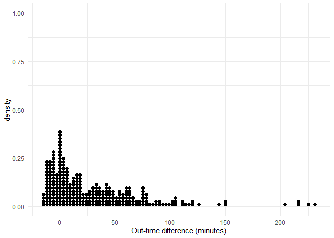
We can observe that the number of observations are high at the starting and slowly tend to drop as time progresses.
Dot Plot/Dot Chart
Displays the values of a single variable as symbols plotted along a line. With a separate line for each observation, it is generally constructed after sorting the rows of the data table.
df = attendance %>% arrange(as.numeric(diff.out.time))
ggplot(df,
       aes(x=as.numeric(row.names(df)), y = as.numeric(diff.out.time))) +
  geom_point() +
  labs(x = 'count', y='Out time difference (min)') +
  theme_minimal()
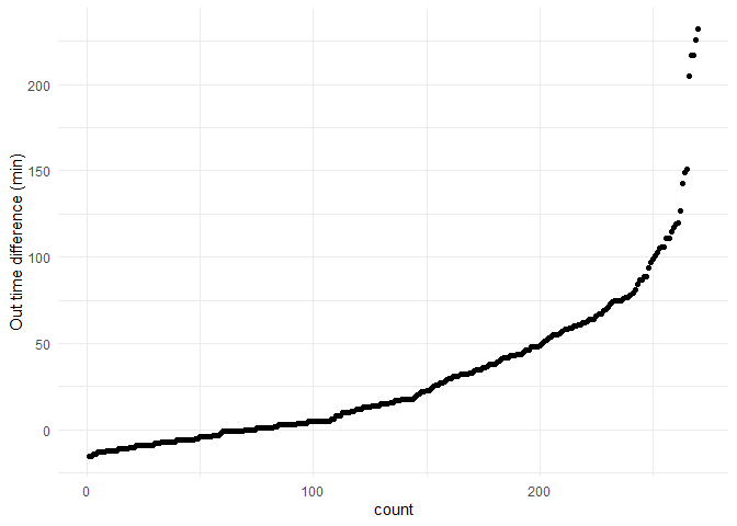
From the graph I can observe that the distribution initially seems to be a exponential distribution.
A sample normal distribution is plotted for reference.
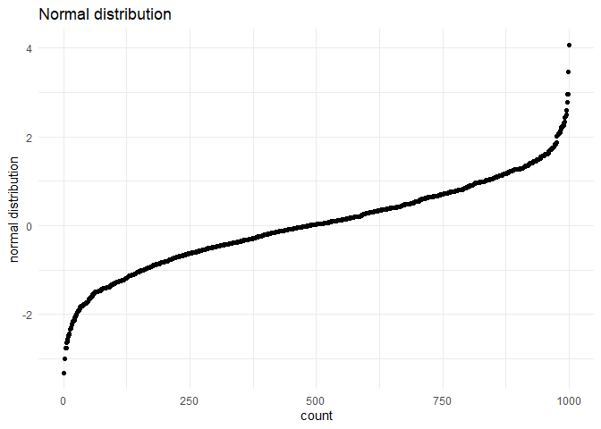
We can see that the distribution looks no where like a normal distribution. I suspect that it is close to a exponential distribution. 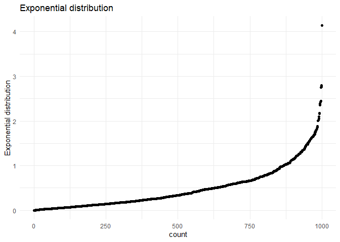
Univariate Summary Plots
Summary plots display an object or a graph that gives a more concise expression of the location, dispersion, and distribution of a variable than an enumerative plot, but this comes at the expense of some loss of information: In a summary plot, it is no longer possible to retrieve the individual data value, but this loss is usually matched by the gain in understanding that results from the efficient representation of the data. Summary plots generally prove to be much better than the enumerative plots in revealing the distribution of the data.
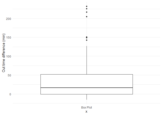
Box plot
A simple way of representing statistical data on a plot in which a rectangle is drawn to represent the second and third quartiles, usually with a vertical line inside to indicate the median value. The lower and upper quartiles are shown as horizontal lines either side of the rectangle.
ggplot(attendance, aes(x="Box Plot", y= as.numeric(diff.out.time), group = 123)) +
  geom_boxplot() +
  labs(y='Out time difference (min)') +
  theme_minimal()
Histograms
The other summary plots are of various types:
- Histograms: Histograms are a type of bar chart that displays the counts or relative frequencies of values falling in different class intervals or ranges.
- Density Plots: A density plot is a plot of the local relative frequency or density of points along the number line or x-axis of a plot. The local density is determined by summing the individual "kernel" densities for each point. Where points occur more frequently, this sum, and consequently the local density, will be greater.
legendcols <- c("Normal distribution"="darkred","Density"="darkBlue","Histogram"="lightBlue")
ggplot(attendance,aes(x = as.numeric(diff.out.time))) +
  geom_histogram(aes(y=..density.., fill ="Histogram"), bins = 50) +
    stat_function(fun = dnorm, aes(color="Normal distribution"),  size = 1,
                args = list(mean = mean(as.numeric(attendance$diff.out.time)),
                                         sd = sd(as.numeric(attendance$diff.out.time)) )) +
  geom_density(aes(y=..density.., color="Density"),  size = 1)+
  scale_colour_manual(name="Distribution",values=legendcols) +
  scale_fill_manual(name="Bar",values=legendcols) +
  labs(x = 'Out-time difference (minutes)', y='Density') +
  theme_minimal() + theme(legend.position="bottom")
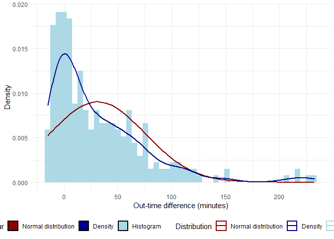
In the above graph, the red line is normal distribution(with the same mean and sd) while the blue line is the density plot of in-time.
Q-Q plot
In statistics, a Q-Q (quantile-quantile) plot is a probability plot, which is a graphical method for comparing two probability distributions by plotting their quantiles against each other.
If the two distributions being compared are similar, the points in the Q-Q plot will approximately lie on the line y = x. If the distributions are linearly related, the points in the Q-Q plot will approximately lie on a line, but not necessarily on the line y = x. Q-Q plots can also be used as a graphical means of estimating parameters in a location-scale family of distributions.
A Q-Q plot is used to compare the shapes of distributions, providing a graphical view of how properties such as location, scale, and skewness are similar or different in the two distributions.
Below is a Q-Q plot with a normal distribution
ggplot(attendance,aes(sample = as.numeric(diff.out.time))) +
  stat_qq() + stat_qq_line() +
  ggtitle("Normal distribution Q-Q plot") +
  theme_minimal()
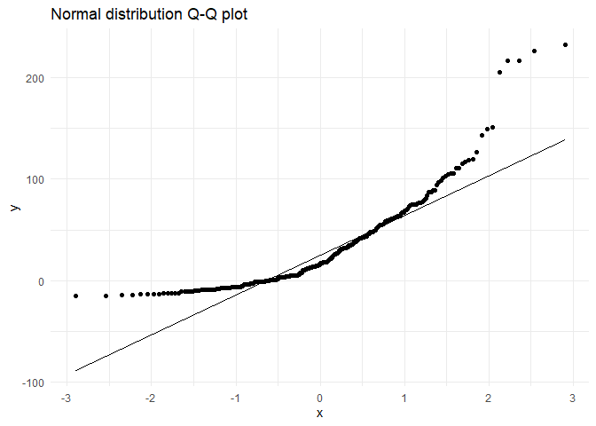
We can clearly see that the distribution is not a normal distribution.
Trying to check with exponential distribution
params <- as.list(fitdistr(rexp(nrow(attendance), rate = 2), "exponential")$estimate)
ggplot(attendance,aes(sample = as.numeric(diff.out.time))) +
  stat_qq(distribution = qexp, dparams = params) +
  stat_qq_line(distribution = qexp, dparams = params) +
  ggtitle("Exponential distribution Q-Q plot") +
  theme_minimal()
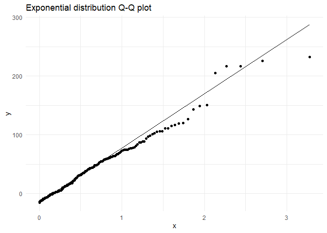
From the above graph I am approximating my distribution to an exponential distribution.
lamda <- 1/mean(sd(as.numeric(attendance$diff.out.time)),mean(as.numeric(attendance$diff.out.time)))
exp.curve <- function(x){
                lamda*exp(-lamda*(x +15))
}
legendcols <- c("Exponential distribution"="darkred","Density"="darkBlue","Histogram"="lightBlue")
ggplot(attendance,aes(x = as.numeric(diff.out.time))) +
  geom_histogram(aes(y=..density.., fill ="Histogram"), bins = 50) +
  stat_function(fun = exp.curve, aes(color="Exponential distribution"),  size = 1) +
  geom_density(aes(y=..density.., color="Density"),  size = 1)+
  scale_colour_manual(name="Distribution",values=legendcols) +
  scale_fill_manual(name="Bar",values=legendcols) +
  labs(x = 'Out-time difference (minutes)', y='Density') +
  theme_minimal() + theme(legend.position="bottom")
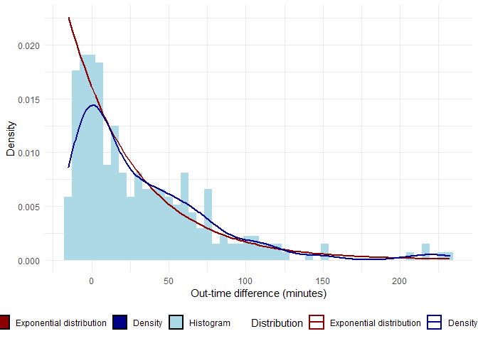
In the above graph, the red line is exponential distribution( lambda = 1/mean, mean = mean of the distribution) while the blue line is the density plot of in-time.
Created using RMarkdown